

Groups
BuddyPress Groups let members create communities within your community. BuddyX Pro enhances groups with beautiful layouts, custom cover images, and extensive customization options.
Where these settings live: Groups Directory controls are in Customizer > Community Settings > Groups Directory, and single-group controls are in Customizer > Community Settings > Single Group. The default directory view is Style 2 (Card).
Youzify note: The Community Settings panel (including every Groups control) is removed when the Youzify plugin is active. Run BuddyPress without Youzify to use these options.
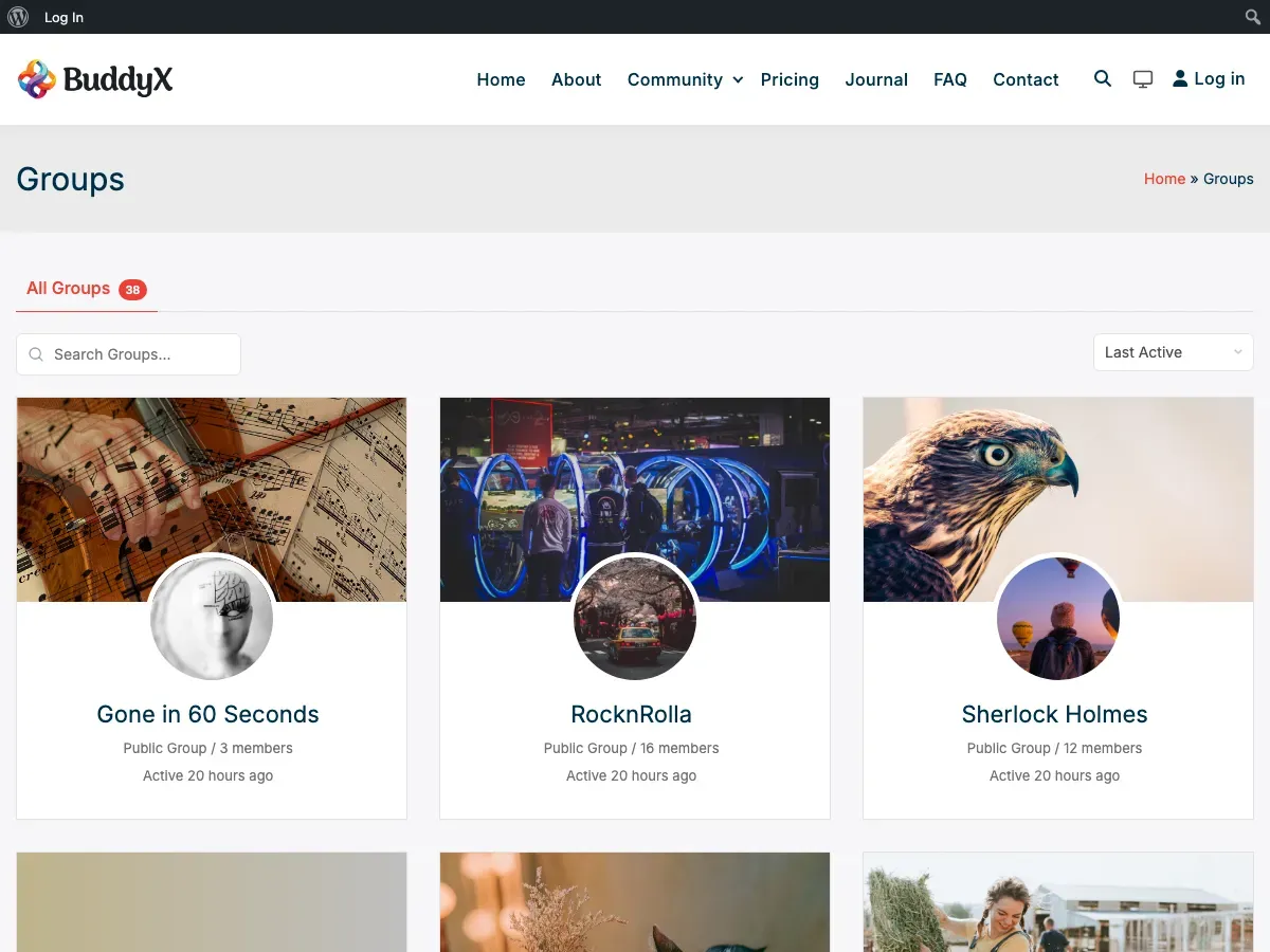
What You Can Do with Groups
Section titled “What You Can Do with Groups”BuddyX Pro provides powerful group features:
- 2 Directory Layout Styles - List or card views
- 6 Header Layout Options - For single group pages
- Custom Cover Images - Visual group identity
- Group Type Badges - Categorize groups visually
- Privacy Indicators - Public/Private/Hidden badges
- Activity Integration - Group-specific activity streams
- Member Lists - Showcase group members
- Organizer Display - Highlight group admins
- Join/Leave Buttons - Easy membership management
Groups Directory Layouts
Section titled “Groups Directory Layouts”Choose how groups appear in your directory.
Style 1: List View
Section titled “Style 1: List View”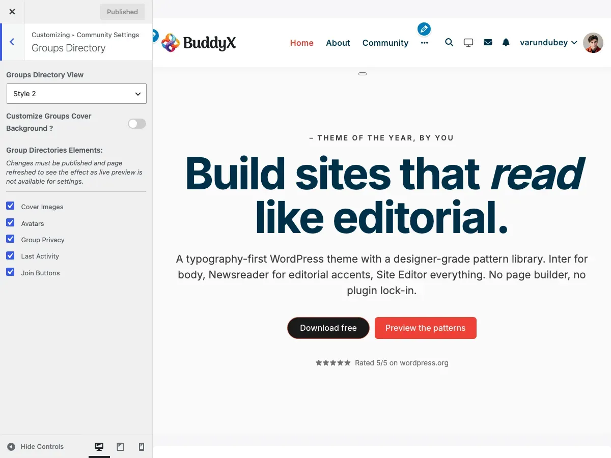
Best For: Simple communities, few groups
Features:
- Horizontal list layout
- Group avatar on left
- Info on right
- Classic forum style
- Maximum information density
What Displays:
- Group avatar (square or circular)
- Group name and description
- Last activity timestamp
- Member count
- Privacy status (Public/Private/Hidden)
- Join/Leave button
When to Use:
- Communities with <20 groups
- Forum-style sites
- Information-focused layouts
- Desktop-primary audiences
Style 2: Card with Cover Images (Default)
Section titled “Style 2: Card with Cover Images (Default)”
Best For: Visual communities, active groups
Features:
- Card-based grid layout
- Cover images at top
- Avatar overlays cover
- Modern, visual design
- Instagram-like cards
What Displays:
- Cover image background
- Group avatar (overlapping cover)
- Group name
- Privacy badge
- Member count
- Last activity
- Join button
When to Use:
- Communities with many active groups
- Visual, modern brands
- Groups with cover images
- Communities encouraging group creation
Requirements:
- Looks best when groups have cover images
- Custom default cover recommended
How to Change Layout
Section titled “How to Change Layout”- Go to Appearance > Customize
- Navigate to Community Settings > Groups Directory
- Find Groups Directory View
- Select: Style 1 or Style 2 (Card)
- Click Publish
- Visit groups directory to see changes
Note: Publish and refresh page to see changes. Live preview not available.
Group Directory Elements
Section titled “Group Directory Elements”Control what information appears on group cards.
Available Elements
Section titled “Available Elements”| Element | What It Shows | Default | Available In |
|---|---|---|---|
| Cover Images | Group cover photo | On | Style 2 only |
| Avatars | Group profile picture | On | All styles |
| Group Privacy | Public/Private/Hidden | On | All styles |
| Last Activity | Recent activity time | On | All styles |
| Members | Member count | On | BuddyBoss only |
| Group Descriptions | Brief description | On | BuddyBoss only |
| Join Buttons | Join/Leave actions | On | All styles |
How to Configure Elements
Section titled “How to Configure Elements”- Customizer > Community Settings > Groups Directory
- Scroll to Group Directories Elements
- Check/uncheck desired elements
- Click Publish
- Refresh groups page
Important: Changes require publishing and page refresh.
Element Details
Section titled “Element Details”Cover Images
Section titled “Cover Images”Available: Style 2 (Card) only
What It Is:
- Banner image at top of card
- Visible in directory
- Uploaded by group admins
Why Show:
- Visual group identity
- Attractive directory
- Encourages group branding
Why Hide:
- Cleaner, simpler layout
- Faster loading
- Few groups have covers
Performance: Disable if page load is slow with many groups.
Avatars
Section titled “Avatars”What It Is:
- Group profile picture
- Appears on all layouts
Why Show:
- Visual group recognition
- Professional appearance
- Standard expectation
Why Hide:
- Text-only preference (rare)
- Extreme minimalism
Recommendation: Keep enabled. Avatars are core to group identity.
Group Privacy
Section titled “Group Privacy”What It Shows:
- Public - Anyone can see and join
- Private - Visible, join requires approval
- Hidden - Invitation-only, not visible in directory
Why Show:
- Transparency
- Helps members understand access
- Reduces confusion
Why Hide:
- All groups same privacy level
- Minimalist design
Recommendation: Keep enabled for clarity.
Last Activity
Section titled “Last Activity”What It Shows:
- “Active 2 hours ago”
- “Active this week”
- Relative timestamps
Why Show:
- Shows active vs inactive groups
- Helps members find engagement
- Encourages participation
Why Hide:
- Don’t want to highlight inactive groups
- All groups consistently active
Members Count (BuddyBoss Only)
Section titled “Members Count (BuddyBoss Only)”What It Shows:
- Total member count
- “24 members” text
Why Show:
- Popular group indicator
- Helps members find active groups
- Social proof
Why Hide:
- Don’t want to highlight small groups
- Equal emphasis on all groups
Group Descriptions (BuddyBoss Only)
Section titled “Group Descriptions (BuddyBoss Only)”What It Shows:
- Brief group description text
- Excerpt from full description
Why Show:
- Helps members understand group purpose
- Better browsing experience
- More context
Why Hide:
- Cleaner, simpler cards
- Group names self-explanatory
Join Buttons
Section titled “Join Buttons”What It Shows:
- Join Group - For public groups
- Request Membership - For private groups
- Leave Group - If already member
- No button for hidden groups
Why Show:
- Quick group joining
- Better user experience
- Standard functionality
Why Hide:
- Force visits to group page first
- Reduce accidental joins (rare)
Recommendation: Keep enabled for best user experience.
Cover Image Customization
Section titled “Cover Image Customization”Available for: Style 2 (Card) layout
BuddyBoss note: The Customize Groups Cover Background switch and Set Default Cover Image upload appear only on a BuddyPress (non-BuddyBoss) site. When BuddyBoss Platform is active, BuddyBoss handles group cover images and the theme hides these two controls.
Add visual appeal with group cover images.
Setting Default Cover Images
Section titled “Setting Default Cover Images”Provide fallback cover when groups don’t upload their own:
- Customizer > Community Settings > Groups Directory
- Enable Customize Groups Cover Background
- Click Set Default Cover Image
- Upload your image
- Click Publish
Cover Image Best Practices
Section titled “Cover Image Best Practices”Recommended Dimensions: 1300px x 225px
Design Tips:
- Use community-themed images
- Subtle patterns work best
- Avoid text (accessibility)
- Keep file size under 200KB
- Test with avatar overlay
- Consider group avatar position
Good Default Ideas:
- Branded gradient
- Community logo watermark
- Abstract patterns
- Thematic backgrounds
- Solid colors with texture
What to Avoid:
- Busy photos
- Dark colors (poor avatar contrast)
- Text or detailed logos
- Stock photos of people
Group Admin Upload Process
Section titled “Group Admin Upload Process”Group admins can upload custom covers:
- Visit group page
- Click Change Cover Image (on cover area)
- Drag and drop or browse
- Crop if needed
- Click Upload
Requirements:
- Must be group admin or moderator
- BuddyPress cover images enabled
- Logged in
Single Group Layouts
Section titled “Single Group Layouts”Customize individual group pages.
Header Layout Options
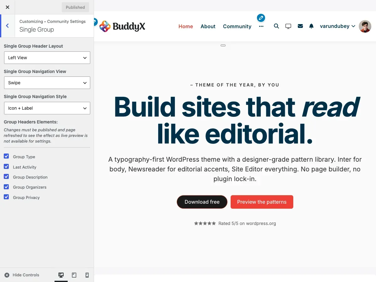
Section titled “Header Layout Options”Choose from 6 layouts (same as member profiles):
| Layout | Description | Best For |
|---|---|---|
| Left View | Avatar left, info right, full width | Classic group pages |
| Container View | Centered, contained width | Boxed layouts |
| Container Left View | Left layout, contained | Professional communities |
| Container Centered View | Centered, contained | Formal organizations |
| Stretch Left View | Left layout, full browser width | Visual impact |
| Stretch Centered View | Centered, full browser width | Maximum impact |
How to Change:
- Customizer > Community Settings > Single Group
- Single Group Header Layout: Choose layout
- Publish
Recommended Layout
Section titled “Recommended Layout”Left View is recommended for most communities because:
- Familiar layout - Users expect avatar on left, info on right (like Facebook groups, LinkedIn)
- Easy scanning - Eye naturally flows left to right
- Action buttons accessible - Prominent placement for Join Group, Send Message
- Works at all screen sizes - Responsive without awkward reflows
- Professional appearance - Clean, traditional social network feel
Use centered or stretch layouts only if your design specifically calls for it (portfolios, creative communities, magazine-style sites).
Navigation Options
Section titled “Navigation Options”Navigation View:
- More - Extra tabs in dropdown
- Swipe - Horizontal scrolling tabs
Navigation Style:
- Default - Text only
- Icon + Label - Icons with text
- Icon + Label (Swipe 1) - Compact for swipe
- Icon + Label (Swipe 2) - Larger for swipe
Configuration:
- Customizer > Community Settings > Single Group
- Single Group Navigation View: Choose More or Swipe
- Single Group Navigation Style: Choose style
- Publish
Group Header Elements
Section titled “Group Header Elements”Control information displayed in group headers.
Available Elements
Section titled “Available Elements”| Element | What It Shows | Default |
|---|---|---|
| Group Type | Type badge | On |
| Last Activity | Recent activity | On |
| Group Description | Full description | On |
| Group Organizers | Admin/mod list | On |
| Group Privacy | Privacy status | On |
How to Configure
Section titled “How to Configure”- Customizer > Community Settings > Single Group
- Scroll to Group Headers Elements
- Check/uncheck elements
- Publish and refresh
Element Details
Section titled “Element Details”Group Type
Section titled “Group Type”What It Is:
- Visual badge showing group category
- Examples: “School”, “Project”, “Social”
Why Show:
- Multiple group categories
- Help members understand purpose
- Visual organization
Why Hide:
- All groups same type
- Simpler design
Requirements: Group Types must be set up in BuddyPress.
Last Activity
Section titled “Last Activity”Shows: Most recent group activity timestamp
Why Show: Indicates active vs dormant groups
Why Hide: Privacy or all groups equally active
Group Description
Section titled “Group Description”Shows: Full group description text
Why Show: Clear group purpose and rules
Why Hide: Minimal design, description obvious from name
Group Organizers
Section titled “Group Organizers”Shows:
- Group creator
- Administrators
- Moderators
- Avatar and name
Why Show:
- Contact information
- Accountability
- Community transparency
Why Hide:
- Anonymous group structure
- Minimal information preference
Group Privacy
Section titled “Group Privacy”Shows: Public/Private/Hidden status with icon
Why Show: Clear access expectations
Why Hide: All groups same privacy level
Group Types
Section titled “Group Types”Categorize groups for better organization.
What Are Group Types?
Section titled “What Are Group Types?”Group types let you categorize groups:
- Study Groups vs Social Groups
- Regional Chapters
- Project Teams vs Discussion Groups
- Free vs Premium Groups
Setting Up Group Types
Section titled “Setting Up Group Types”- Install group types plugin or use custom code
- Define group type taxonomy
- Assign types when creating groups
- BuddyX Pro displays type badges automatically
Where Types Appear
Section titled “Where Types Appear”- Group directory cards
- Single group header
- Group search filters
To Hide Type Badges:
- Customizer > Community Settings > Single Group
- Uncheck Group Type
- Publish
Group Privacy Levels
Section titled “Group Privacy Levels”Understand BuddyPress group privacy options.
Public Groups
Section titled “Public Groups”Visibility: Listed in directory, visible to all
Who Can Join: Anyone
Content Visibility: Public activity
Best For:
- Open communities
- Public discussions
- Marketing/brand groups
- Community announcements
Private Groups
Section titled “Private Groups”Visibility: Listed in directory
Who Can Join: Requires approval
Content Visibility: Members only
Best For:
- Semi-private discussions
- Teams requiring approval
- Alumni groups
- Professional groups
Hidden Groups
Section titled “Hidden Groups”Visibility: Not in directory (invitation only)
Who Can Join: Invitation required
Content Visibility: Members only
Best For:
- Secret projects
- Executive teams
- Support groups
- VIP access
Note: BuddyX Pro displays privacy badges to help members understand access levels.
Group Activity Feeds
Section titled “Group Activity Feeds”Every group has its own activity stream.
What Appears in Group Activity
Section titled “What Appears in Group Activity”- Member posts to group
- Group announcements
- New member joins
- Group updates
- Uploaded media (with plugins)
Activity Features
Section titled “Activity Features”For Members:
- Post directly to group
- Comment on group activity
- Like/react to posts
- Share activity
For Admins:
- Pin important posts
- Delete inappropriate content
- Moderate discussions
Location: Single group page, Activity tab
Group Member Lists
Section titled “Group Member Lists”Show who’s in each group.
What’s Displayed
Section titled “What’s Displayed”- All group members
- Admins and moderators highlighted
- Member avatars
- Join dates
- Member roles
Admin Actions
Section titled “Admin Actions”Group admins can:
- Promote to admin/moderator
- Remove members
- Ban members
- Send group messages
Location: Single group page, Members tab
Creating Groups
Section titled “Creating Groups”How members create new groups.
Group Creation Process
Section titled “Group Creation Process”- Click Create a Group button
- Details: Name, description, privacy
- Settings: Enable features
- Cover/Avatar: Upload images
- Invite: (optional) Invite members
- Click Finish
Admin Settings for Group Creation
Section titled “Admin Settings for Group Creation”Who Can Create Groups:
Set in Settings > BuddyPress > Settings > Group Creation
Options:
- All members
- Administrators only
- Specific user roles (with plugins)
Recommendation: Start restricted, open up as community matures.
Common Questions
Section titled “Common Questions”Q: Can I limit how many groups a member can create? A: Not in BuddyPress by default. Requires custom plugin.
Q: How do I delete a group? A: Group admins can delete from group settings, or WordPress admins from admin dashboard.
Q: Can groups have subgroups? A: Not natively. Requires hierarchical groups plugin.
Q: What’s the difference between admin and moderator? A: Admins have full control. Moderators can moderate content but not delete group.
Q: Can I disable group creation entirely? A: Yes. Settings > BuddyPress > Settings > Restrict group creation to admins.
Q: How do I make all new groups require approval? A: Requires custom code or plugin. Not a default BuddyPress option.
Q: Why don’t my cover images appear in directory? A: Cover images only show in Style 2 (Card) layout. Switch from Style 1.
Q: Can I change the default group privacy? A: Not through theme settings. Requires custom code modification.
Q: How do I feature/pin certain groups at top? A: Requires custom code or groups featured plugin.
Q: Can members join multiple groups? A: Yes, unlimited by default.
Recommended Configurations by Community Type
Section titled “Recommended Configurations by Community Type”Educational Institution
Section titled “Educational Institution”- Layout: Style 1
- Show: Group Type, Descriptions, Organizers, Members
- Group Types: Classes, Clubs, Departments
- Why: Information-focused, clear organization
Professional Network
Section titled “Professional Network”- Layout: Style 2 (Card)
- Show: Group Type, Privacy, Members, Join Buttons
- Hide: Last Activity, Descriptions
- Why: Visual, professional appearance
Hobby/Interest Community
Section titled “Hobby/Interest Community”- Layout: Style 2 (Card)
- Show: Cover Images, Last Activity, Members, Descriptions
- Custom Covers: Themed backgrounds
- Why: Engaging, visual, activity-focused
Corporate/Internal
Section titled “Corporate/Internal”- Layout: Style 1
- Show: Group Type, Organizers, Privacy, Descriptions
- Hide: Join Buttons (controlled access)
- Why: Professional, controlled, informative
Gaming Community
Section titled “Gaming Community”- Layout: Style 2 (Card)
- Show: Cover Images, Last Activity, Members
- Hide: Descriptions (prefer short names)
- Why: Visual, competitive, activity-driven
Related Settings
Section titled “Related Settings”- BuddyPress Customizer Settings - All customizer options
- Member Directory - Member layouts and features
- Activity Stream - Group activity feeds
- Member Profiles - Group member profiles
Got a question? We’re a friendly team - happy to help.
- Visit our Documentation Portal
- Email us at support@wbcomdesigns.com
- View Video Tutorials