

Heading Typography
Control the appearance of all headings (H1-H6) on your BuddyX Pro website. These settings help you create a consistent visual hierarchy that guides your visitors through your content.
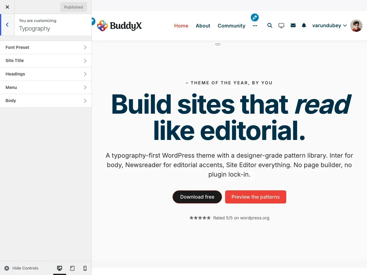
Accessing Heading Settings
Section titled “Accessing Heading Settings”- Go to Appearance > Customize
- Click on Typography
- Select Headings Typography
You’ll see individual controls for each heading level from H1 (largest) down to H6 (smallest).
What You Can Do
Section titled “What You Can Do”With heading typography settings, you can:
- Choose unique fonts for each heading level or use one consistent font family
- Set appropriate sizes to create clear visual hierarchy
- Adjust font weights (light, regular, bold, etc.)
- Control spacing between letters and lines
- Transform text (uppercase, lowercase, capitalize)
- Align headings (left, center, right)
- Create distinct looks for different site sections
Heading Levels Explained
Section titled “Heading Levels Explained”H1 - Main Page Title
Section titled “H1 - Main Page Title”Default Settings:
- Font Family: Default (theme baseline: system-ui)
- Font Size: 30px
- Line Height: 1.4
- Letter Spacing: 0
Where It Appears:
- Page titles at the top of content
- Blog post titles
- BuddyPress profile headers
- Main entry titles
Best Practices:
- Largest heading on any page
- Only one H1 per page (WordPress handles this automatically)
- Should be immediately attention-grabbing
- Recommended size: 28px - 48px
H2 - Section Headings
Section titled “H2 - Section Headings”Default Settings:
- Font Family: Default (theme baseline: system-ui)
- Font Size: 24px
- Line Height: 1.4
- Letter Spacing: 0
Where It Appears:
- Widget titles
- Major section dividers
- Subheadings under main content
- Product category titles (FluentCart)
Best Practices:
- Second most prominent heading
- Use for major content sections
- Recommended size: 22px - 36px
- Consider slightly heavier weight than H1
H3 - Subsection Headings
Section titled “H3 - Subsection Headings”Default Settings:
- Font Family: Default (theme baseline: system-ui)
- Font Size: 22px
- Line Height: 1.4
- Letter Spacing: 0
Where It Appears:
- BuddyPress group separators
- Blog post subheadings
- Card titles
- Nested content sections
Best Practices:
- Third level in hierarchy
- Recommended size: 20px - 28px
- Should be noticeably smaller than H2
H4 - Smaller Subheadings
Section titled “H4 - Smaller Subheadings”Default Settings:
- Font Family: Default (theme baseline: system-ui)
- Font Size: 20px
- Line Height: 1.4
- Letter Spacing: 0
Where It Appears:
- Form section labels
- Sidebar widget subheadings
- Tab titles
- Comment section headers
Best Practices:
- Recommended size: 18px - 24px
- Can use slightly lighter weight
- Good for breaking up dense content
H5 - Minor Headings
Section titled “H5 - Minor Headings”Default Settings:
- Font Family: Default (theme baseline: system-ui)
- Font Size: 18px
- Line Height: 1.4
- Letter Spacing: 0
Best Practices:
- Recommended size: 16px - 20px
- Often same size as body text but bold
- Use sparingly for deep content structure
H6 - Smallest Heading
Section titled “H6 - Smallest Heading”Default Settings:
- Font Family: Default (theme baseline: system-ui)
- Font Size: 16px
- Line Height: 1.4
- Letter Spacing: 0
Best Practices:
- Recommended size: 14px - 18px
- Rarely used in most sites
- Can match body text size with different weight
Heading Typography Options
Section titled “Heading Typography Options”Each heading level has the same customization options:
| Option | Description | Examples |
|---|---|---|
| Font Family | Choose from Google Fonts or system fonts | Nunito Sans, Roboto, Montserrat |
| Font Weight | Thickness of the font | 300 (Light), 400 (Regular), 600 (Semi Bold), 700 (Bold) |
| Font Style | Normal or italic | Regular, Italic |
| Font Size | Height of the text | 16px, 24px, 2rem |
| Line Height | Space between lines | 1.2 (tight), 1.4 (normal), 1.6 (relaxed) |
| Letter Spacing | Space between characters | 0 (default), 0.05em (loose), -0.02em (tight) |
| Text Transform | Case style | none, uppercase, lowercase, capitalize |
| Text Align | Horizontal alignment | left, center, right |
| Text Decoration | Additional styling | none, underline |
Recommended Font Combinations by Site Type
Section titled “Recommended Font Combinations by Site Type”Corporate Site
Section titled “Corporate Site”Goal: Professional, trustworthy, clean
H1-H3: Montserrat (Bold, 600-700 weight)H4-H6: Montserrat (Semi Bold, 500-600 weight)Body: Roboto (Regular, 400 weight)
Visual Effect: Modern corporate feel with excellent readability
Settings:
- H1: 38px, Line Height 1.2, Letter Spacing -0.01em
- H2: 30px, Line Height 1.3, Letter Spacing -0.01em
- H3: 24px, Line Height 1.4
- H4-H6: Decrease by 2px each
Creative Agency
Section titled “Creative Agency”Goal: Bold, unique, attention-grabbing
Headings: Poppins (Bold, 700 weight)Body: Inter (Regular, 400 weight)
Visual Effect: Strong personality with geometric precision
Settings:
- H1: 42px, Line Height 1.1, Letter Spacing -0.02em, Transform: uppercase
- H2: 32px, Line Height 1.2, Letter Spacing 0.01em
- H3: 26px, Line Height 1.3
- Tight line height creates impact
- Generous letter spacing for uppercase text
Blog or Magazine
Section titled “Blog or Magazine”Goal: Readable, comfortable, editorial
Headings: Playfair Display or Merriweather (Regular, 400 weight)Body: Lora or Georgia (Regular, 400 weight)
Visual Effect: Classic editorial look, easy on the eyes for long reading
Settings:
- H1: 36px, Line Height 1.3, Weight: 700
- H2: 28px, Line Height 1.4, Weight: 600
- H3: 24px, Line Height 1.5
- Relaxed line heights for comfort
- Serif fonts add elegance
E-commerce Store
Section titled “E-commerce Store”Goal: Clear, modern, conversion-focused
Headings: Source Sans Pro (Semi Bold, 600 weight)Body: Source Sans Pro (Regular, 400 weight)
Visual Effect: Unified, professional, optimized for scanning
Settings:
- H1: 32px, Line Height 1.3 (product titles need to work in grids)
- H2: 26px, Line Height 1.4 (category headers)
- H3: 22px, Line Height 1.4 (product details)
- Same font family for cohesion
- Moderate sizes for dense product info
Community Platform
Section titled “Community Platform”Goal: Friendly, welcoming, social
Headings: Nunito Sans (Semi Bold, 600 weight)Body: Nunito Sans (Regular, 400 weight)
Visual Effect: Rounded, approachable, perfect for social interactions
Settings:
- H1: 30px, Line Height 1.4
- H2: 24px, Line Height 1.4
- H3: 22px, Line Height 1.4
- Consistent line heights create rhythm
- Rounded fonts feel friendlier
- Moderate sizes work well with avatars and user content
Creating Visual Hierarchy
Section titled “Creating Visual Hierarchy”The Size Ratio Method
Section titled “The Size Ratio Method”A proven approach is to use consistent ratios between heading sizes:
Classic Scale (1.25 ratio):
- H1: 30px
- H2: 24px (30 ÷ 1.25)
- H3: 19.2px (round to 20px)
- H4: 16px
- H5: 13px
- H6: 10px
Modern Scale (1.33 ratio - “Perfect Fourth”):
- H1: 38px
- H2: 28px
- H3: 21px
- H4: 16px
- H5: 12px
- H6: 9px
Bold Scale (1.5 ratio):
- H1: 48px
- H2: 32px
- H3: 21px
- H4: 14px
Use the ratio that matches your site’s personality: classic for traditional sites, modern for most current websites, bold for creative or marketing sites.
The Weight Contrast Method
Section titled “The Weight Contrast Method”Instead of large size differences, use weight variations:
All Headings: 18px - 24px range
- H1: 24px, Weight 800
- H2: 22px, Weight 700
- H3: 20px, Weight 600
- H4: 18px, Weight 500
- H5: 18px, Weight 400
- H6: 18px, Weight 300
This creates subtle hierarchy perfect for minimalist designs or dense informational content.
Font Weight Guidelines
Section titled “Font Weight Guidelines”Understanding font weights helps you make better choices:
| Weight | Number | When to Use |
|---|---|---|
| Thin | 100 | Rarely used, decorative only |
| Extra Light | 200 | Hero text on light backgrounds |
| Light | 300 | Large headings, elegant feel |
| Regular | 400 | Body text standard |
| Medium | 500 | Subtle emphasis, H5-H6 |
| Semi Bold | 600 | Most headings, H2-H4 |
| Bold | 700 | Strong headings, H1-H2 |
| Extra Bold | 800 | Impact headings, marketing |
| Black | 900 | Maximum impact, use sparingly |
Important: Not all fonts support all weights. Google Fonts shows available weights in the Customizer font picker.
Line Height Best Practices
Section titled “Line Height Best Practices”Line height affects readability and visual rhythm:
| Line Height | Best For | Example Use |
|---|---|---|
| 1.0 - 1.2 | Large display headings | Hero H1, landing page titles |
| 1.2 - 1.4 | Standard headings | H1-H3, most heading use |
| 1.4 - 1.6 | Small headings | H4-H6, matches body text |
| 1.6 - 1.8 | Body text | Paragraph content |
Rule of Thumb: Larger text = tighter line height. As font size increases, line height can decrease.
Letter Spacing Guidelines
Section titled “Letter Spacing Guidelines”Letter spacing (tracking) fine-tunes readability:
| Spacing | Effect | When to Use |
|---|---|---|
| -0.02em to -0.01em | Tighter | Large headings, saves space |
| 0 | Default | Most general use |
| 0.01em to 0.05em | Looser | Uppercase text, improves legibility |
| 0.1em+ | Very loose | All-caps subheadings, design effect |
Golden Rule: When using uppercase text, always add positive letter spacing (0.05em minimum).
Responsive Considerations
Section titled “Responsive Considerations”Heading sizes that work on desktop may be too large on mobile. Consider:
Mobile-Friendly Sizes
Section titled “Mobile-Friendly Sizes”- H1: Max 30px on mobile (even if 48px on desktop)
- H2: Max 24px on mobile
- Reduce desktop sizes by 20-30% for mobile
- Use CSS media queries or WordPress block editor responsive settings
Responsive Strategies
Section titled “Responsive Strategies”- Proportional Scaling: Reduce all headings by same percentage on mobile
- Flattened Hierarchy: Make H1-H3 closer in size on small screens
- Viewport Units: Use vw units for headings that scale with screen width
BuddyX Pro automatically handles some responsive adjustments, but you can fine-tune via Additional CSS if needed.
Accessibility Guidelines
Section titled “Accessibility Guidelines”Make your headings accessible to all users:
Contrast Requirements
Section titled “Contrast Requirements”- Regular text: 4.5:1 minimum contrast ratio
- Large text (18px+): 3:1 minimum contrast ratio
- Most headings qualify as “large text”
- Test contrast at WebAIM Contrast Checker
Structure Requirements
Section titled “Structure Requirements”- Use heading levels in order (H1 → H2 → H3, never skip levels)
- Don’t choose heading levels based on size alone
- Use semantic HTML structure (WordPress handles this)
- Screen readers navigate by heading hierarchy
Font Choice for Accessibility
Section titled “Font Choice for Accessibility”- Avoid decorative fonts for long headings
- Ensure adequate spacing (don’t compress too tightly)
- Test with larger browser text sizes (125%, 150%)
- Sans-serif fonts generally more accessible than serif
Configuration Examples
Section titled “Configuration Examples”Example 1: Modern SaaS Website
Section titled “Example 1: Modern SaaS Website”H1: Poppins, 42px, Weight 700, Line Height 1.2, Letter Spacing -0.01emH2: Poppins, 32px, Weight 600, Line Height 1.3, Letter Spacing 0H3: Poppins, 24px, Weight 600, Line Height 1.4, Letter Spacing 0H4: Poppins, 20px, Weight 500, Line Height 1.4, Letter Spacing 0Body: Inter, 16px, Weight 400, Line Height 1.6
Effect: Bold, contemporary, tech-focusedExample 2: Elegant Portfolio
Section titled “Example 2: Elegant Portfolio”H1: Playfair Display, 48px, Weight 400, Line Height 1.3, Letter Spacing 0H2: Playfair Display, 36px, Weight 400, Line Height 1.4, Letter Spacing 0H3: Lato, 22px, Weight 600, Line Height 1.4, Letter Spacing 0.02em, Transform: uppercaseH4: Lato, 18px, Weight 400, Line Height 1.5, Letter Spacing 0Body: Lato, 17px, Weight 400, Line Height 1.7
Effect: Sophisticated serif headings with clean sans-serif subheadingsExample 3: Friendly Community
Section titled “Example 3: Friendly Community”H1: Nunito Sans, 32px, Weight 700, Line Height 1.3, Letter Spacing 0H2: Nunito Sans, 26px, Weight 600, Line Height 1.4, Letter Spacing 0H3: Nunito Sans, 22px, Weight 600, Line Height 1.4, Letter Spacing 0H4: Nunito Sans, 18px, Weight 500, Line Height 1.5, Letter Spacing 0Body: Nunito Sans, 16px, Weight 400, Line Height 1.6
Effect: Unified, rounded, approachable (recommendation for community sites — not the theme default; the 5.1.0 default uses the system-ui baseline)Example 4: Editorial Blog
Section titled “Example 4: Editorial Blog”H1: Merriweather, 36px, Weight 700, Line Height 1.3, Letter Spacing 0H2: Merriweather, 28px, Weight 700, Line Height 1.4, Letter Spacing 0H3: Open Sans, 20px, Weight 600, Line Height 1.5, Letter Spacing 0.01emH4: Open Sans, 18px, Weight 600, Line Height 1.5, Letter Spacing 0Body: Georgia, 18px, Weight 400, Line Height 1.7
Effect: Classic newspaper style optimized for readingCommon Questions
Section titled “Common Questions”Q: Should all my headings use the same font?
Section titled “Q: Should all my headings use the same font?”A: Not necessarily. Many sites use:
- One font for everything - Most unified, easiest to manage
- Display font for H1-H2, body font for H3-H6 - Popular middle ground
- Serif for headings, sans-serif for body (or vice versa) - Classic pairing
Start with one font family. Only add a second if you have a specific design reason.
Q: Why do my headings look different than in the Customizer preview?
Section titled “Q: Why do my headings look different than in the Customizer preview?”A: Several possible reasons:
- Other plugins might be adding conflicting CSS
- Your content editor (Gutenberg) may override heading styles
- Browser caching - hard refresh (Ctrl+F5 or Cmd+Shift+R)
- Some fonts render differently across operating systems
Check “Additional CSS” for conflicting rules, and clear your cache.
Q: How do I make different heading sizes for mobile and desktop?
Section titled “Q: How do I make different heading sizes for mobile and desktop?”A: BuddyX Pro provides basic responsive handling. For advanced control, add custom CSS:
/* Desktop */@media (min-width: 1024px) {  h1 { font-size: 48px; }}
/* Tablet */@media (min-width: 768px) and (max-width: 1023px) {  h1 { font-size: 36px; }}
/* Mobile */@media (max-width: 767px) {  h1 { font-size: 28px; }}
Add this in Appearance > Customize > Additional CSS.
Q: Some Google Fonts don’t have all weights - what should I do?
Section titled “Q: Some Google Fonts don’t have all weights - what should I do?”A: Each font family supports different weights:
- Roboto - All weights 100-900
- Playfair Display - Limited to 400, 500, 600, 700, 800, 900
- Pacifico - Only 400
Check the font’s Google Fonts page. If your chosen weight isn’t available, the browser will approximate it (not ideal). Choose a font with the weights you need, or adjust your design to use available weights.
Q: What’s the difference between letter spacing and word spacing?
Section titled “Q: What’s the difference between letter spacing and word spacing?”A:
- Letter spacing (tracking) - Space between individual characters. Use this for headings.
- Word spacing - Space between whole words. Rarely adjusted in web design.
BuddyX Pro typography settings control letter spacing, which is what you’ll adjust most often.
Q: My headings look too bold or too light - how do I fix this?
Section titled “Q: My headings look too bold or too light - how do I fix this?”A: Font rendering varies across systems:
- Mac/iOS - Tends to render fonts slightly heavier
- Windows - Often renders fonts lighter
- Linux - Varies by distribution
Choose a weight that looks good on your primary audience’s platform. If unsure, weight 600 is usually safe across all systems for headings.
Q: Can I use different fonts for BuddyPress vs. regular pages?
Section titled “Q: Can I use different fonts for BuddyPress vs. regular pages?”A: Yes, but requires custom CSS:
/* Regular page headings */.page h1 { font-family: 'Montserrat', sans-serif; }
/* BuddyPress headings */.buddypress h1 { font-family: 'Nunito Sans', sans-serif; }
However, using consistent typography site-wide creates better user experience.
Q: How many heading levels should I actually use?
Section titled “Q: How many heading levels should I actually use?”A: Most content needs only H1-H3:
- Simple pages - H1 (title) + H2 (sections)
- Blog posts - H1 (title) + H2 (major sections) + H3 (subsections)
- Documentation - H1-H4 for deep content structure
- Landing pages - Often just H1-H2
Don’t force deeper hierarchy just because you have H4-H6 available. If you need more than four levels, consider reorganizing your content structure.
Troubleshooting
Section titled “Troubleshooting”Issue: Headings don’t match body font settings
Section titled “Issue: Headings don’t match body font settings”Cause: Headings and body have separate typography controls.
Solution:
- Check Typography > Headings Typography for heading settings
- Check Typography > Body Typography for body text settings
- If you want consistent fonts, set the same family in both places
Issue: Customizer shows changes but live site doesn’t
Section titled “Issue: Customizer shows changes but live site doesn’t”Cause: Caching plugin or browser cache.
Solution:
- Click “Publish” in Customizer (don’t just preview)
- Clear your caching plugin cache
- Hard refresh browser (Ctrl+F5 or Cmd+Shift+R)
- Check in incognito/private browsing mode
- If using Cloudflare or CDN, purge cache there too
Issue: Heading hierarchy looks wrong in editor vs. frontend
Section titled “Issue: Heading hierarchy looks wrong in editor vs. frontend”Cause: Block editor uses different styles than theme.
Solution: BuddyX Pro synchronizes editor styles with theme styles. If they still differ:
- Check if another plugin adds editor styles
- Go to Gutenberg > Preferences > Appearance and enable “Show preview”
- Update theme to latest version
Issue: Google Font loads slowly
Section titled “Issue: Google Font loads slowly”Cause: External font files take time to download.
Solution:
- Reduce number of font weights loaded (use 2-3 weights max)
- Use
font-display: swap(BuddyX Pro does this automatically) - Consider system fonts for fastest loading
- Combine with Google Fonts optimization
Issue: Headings look squished or overlapping
Section titled “Issue: Headings look squished or overlapping”Cause: Line height too tight.
Solution:
- Increase line height to minimum 1.2 for large headings
- Add bottom margin if headings touch following content
- Check for negative letter spacing that’s too aggressive
Issue: Uppercase headings hard to read
Section titled “Issue: Uppercase headings hard to read”Cause: Insufficient letter spacing.
Solution:
- Add 0.05em to 0.1em letter spacing for uppercase text
- Consider using sentence case instead
- Reduce font weight slightly (uppercase looks heavier)
Related Settings
Section titled “Related Settings”- Body Typography - Configure main text appearance
- Google Fonts Integration - Font loading and performance
- Site Title Typography - Logo/site name styling
- Menu Typography - Navigation font settings
- Color Scheme - Heading text colors
Performance Tips
Section titled “Performance Tips”- Limit font families - Use 1-2 families maximum (one for headings, one for body)
- Limit font weights - Each weight adds ~20-50KB to page load
- Use system fonts for speed - Zero network requests for fastest possible loading
- Combine with font optimization - See Google Fonts guide for advanced techniques
Got a question? We’re a friendly team - happy to help.
- Visit BuddyX Documentation
- Email us at support@wbcomdesigns.com
- Community Forum: Wbcom Designs Forum