

Side Panel Settings Guide
Configure the slide-out navigation panel that appears on the left side of your site. The Side Panel provides quick access to navigation menus and is perfect for mobile users and sites with extensive navigation.
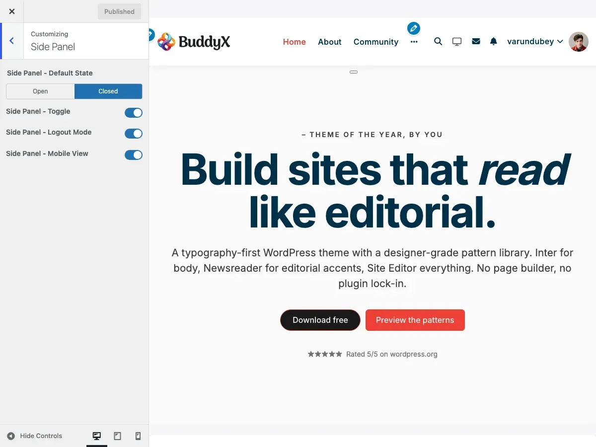
What Is the Side Panel?
Section titled “What Is the Side Panel?”The Side Panel is a slide-out menu that appears from the left side of your screen. Think of it as a navigation drawer similar to mobile apps. It can contain custom menus, widgets, or any navigation items you want quick access to.
What You Can Do
Section titled “What You Can Do”- Show or hide the side panel
- Set it to open or closed by default
- Display different menus for logged-in and logged-out users
- Enable or disable on mobile devices
- Add custom navigation with icons
- Control visibility on specific pages
- Toggle the panel with a button click
Visual Overview
Section titled “Visual Overview”CLOSED STATE: OPEN STATE:
┌──┐ ┌──────────┬──────────┐│ │ │ │ ││ ☰│ Header │ Menu │ Header ││ │ │ Item 1 │ │├──┤ │ Item 2 │──────────┤│ │ │ Item 3 │ ││ │ Main Content │ Item 4 │ Main ││ │ │ Item 5 │ Content ││ │ │ │ ││ │ │ │ │└──┘ └──────────┴──────────┘ ↑ ↑Toggle button Panel slides in from left(3 horizontal lines) Click outside to closeSide Panel Settings
Section titled “Side Panel Settings”Access these settings in Appearance → Customize → Site Side Panel.
Available Options
Section titled “Available Options”| Setting | Default | Description |
|---|---|---|
| Default State | Closed | Panel starts open or closed on page load |
| Toggle Button | Enabled | Show/hide the button that opens the panel |
| Logout Mode | Enabled | Show panel to logged-out users |
| Mobile View | Enabled | Show panel on mobile devices |
Setting Details
Section titled “Setting Details”Default State
Section titled “Default State”Controls how the panel appears when a page loads.
Options:
- Closed (recommended) - Panel hidden, users click to open
- Open - Panel visible immediately
When to use “Open”:
- Sites with primary navigation in panel
- Dashboard-style layouts
- Wide screens where panel doesn’t cover content
When to use “Closed”:
- Content-focused sites
- Mobile-responsive layouts
- Sites where content is primary
Toggle Button
Section titled “Toggle Button”The button that opens and closes the panel.
Enabled:
- Three-line “hamburger” icon appears
- Usually in header area
- Click to open/close panel
Disabled:
- No toggle button shown
- Users can’t open panel
- Useful if you have custom triggers
Logout Mode
Section titled “Logout Mode”Controls panel visibility for logged-out users.
Enabled (default):
- Logged-out users see the panel
- Displays “Logged-Out Menu” if set
- Falls back to main menu
Disabled:
- Panel hidden for logged-out users
- Only logged-in users see it
- Good for member-only navigation
Mobile View
Section titled “Mobile View”Controls panel on small screens (under 768px).
Enabled (default):
- Panel works on mobile devices
- Great for mobile navigation
- Touch-friendly interface
Disabled:
- Panel hidden on mobile
- Mobile users see standard menu
- Use if you have separate mobile menu
How to Configure Side Panel
Section titled “How to Configure Side Panel”Step 1: Enable the Side Panel
Section titled “Step 1: Enable the Side Panel”- Log in to WordPress dashboard
- Go to Appearance → Customize
- Navigate to Site Side Panel
- Ensure Toggle Button is enabled
- Click Publish
Step 2: Set Default State
Section titled “Step 2: Set Default State”Choose how the panel appears on load:
- In Site Side Panel settings
- Find Default State option
- Select Open or Closed
- Click Publish
Most sites work best with “Closed” as default.
Step 3: Configure User Visibility
Section titled “Step 3: Configure User Visibility”Control who sees the panel:
For all users (default):
- Keep Logout Mode enabled
- Panel shows to everyone
For logged-in users only:
- Disable Logout Mode
- Panel hidden for guests
Step 4: Set Mobile Behavior
Section titled “Step 4: Set Mobile Behavior”Choose mobile visibility:
Mobile-friendly (recommended):
- Keep Mobile View enabled
- Panel works on phones/tablets
Desktop-only:
- Disable Mobile View
- Mobile users see different menu
Side Panel Menus
Section titled “Side Panel Menus”The Side Panel displays custom navigation menus. You can set different menus for logged-in and logged-out users.
Menu Locations
Section titled “Menu Locations”BuddyX Pro provides dedicated menu locations:
| Menu Location | Who Sees It | Best For |
|---|---|---|
| BuddyX Panel - Logged in users | Logged-in members | Dashboard, profile, settings |
| BuddyX Panel - Logged out users | Guests/visitors | Login, register, about |
Create a Side Panel Menu
Section titled “Create a Side Panel Menu”Step 1: Create the Menu
Section titled “Step 1: Create the Menu”- Go to Appearance → Menus
- Click Create a new menu
- Name it (e.g., “Side Panel Menu”)
- Click Create Menu
Step 2: Add Menu Items
Section titled “Step 2: Add Menu Items”Add pages, posts, or custom links:
- Select items from left column
- Click Add to Menu
- Drag to reorder items
- Create submenus by dragging items right
Step 3: Assign to Location
Section titled “Step 3: Assign to Location”- Check BuddyX Panel - Logged in users box
- Or check BuddyX Panel - Logged out users
- Click Save Menu
Menu with Icons
Section titled “Menu with Icons”Add icons to side panel menu items for better visual navigation:
Using Menu Icons Plugin
Section titled “Using Menu Icons Plugin”- Install “Menu Icons” plugin
- Go to Appearance → Menus
- Open your side panel menu
- Click triangle to expand menu item
- Choose icon from icon picker
- Save menu
Icon Libraries Supported
Section titled “Icon Libraries Supported”- Font Awesome
- Dashicons
- Genericons
- Custom SVG icons
Customize Panel Content
Section titled “Customize Panel Content”Default Content
Section titled “Default Content”By default, the panel shows:
- Navigation menu items
- Submenu items (expandable)
- Icon + text labels
Custom Content with Hooks
Section titled “Custom Content with Hooks”Developers can add custom content:
// Add content before menuadd_action( 'buddyx_before_inner_panel', 'custom_panel_content' );
// Add content after menuadd_action( 'buddyx_after_inner_panel', 'custom_panel_footer' );
Per-Page Panel Control
Section titled “Per-Page Panel Control”Hide the side panel on specific pages, posts, or any public CPT via the unified Page Settings meta box (5.1.0+):
- Edit the entry (works in the block and classic editors)
- Scroll below the post content area to the Page Settings panel
- Open the Display section and set Side panel to Hide
- Update the entry
Customers who already saved the legacy “Side Panel Settings -> Hide Side Panel” checkbox keep their preference - the unified panel reads / writes the same _hide_show_side_panel meta key, so no migration is needed.
This is useful for:
- Landing pages
- Checkout pages
- Full-screen presentations
- Login/registration pages
Recommended Menu Configurations by Site Type
Section titled “Recommended Menu Configurations by Site Type”Community Site (BuddyPress)
Section titled “Community Site (BuddyPress)”Logged-in Menu:
- Dashboard
- My Profile
- Messages
- Notifications
- Friends
- Groups
- Activity
- Members
- Settings
Logged-out Menu:
- Home
- About
- Login
- Register
- Features
- Contact
E-Commerce Site (WooCommerce)
Section titled “E-Commerce Site (WooCommerce)”Logged-in Menu:
- Shop
- My Account
- Orders
- Wishlist
- Cart
- Checkout
Logged-out Menu:
- Shop
- Categories
- Sale
- New Arrivals
- Login/Register
- About
Learning Site (LearnDash/LearnPress)
Section titled “Learning Site (LearnDash/LearnPress)”Logged-in Menu:
- My Courses
- All Courses
- My Progress
- Certificates
- Assignments
- Profile
- Support
Logged-out Menu:
- Browse Courses
- Course Categories
- Instructors
- Pricing
- Login
- Enroll Now
Membership Site
Section titled “Membership Site”Logged-in Menu:
- Dashboard
- My Account
- Members Area
- Downloads
- Support
- Community
- Settings
- Logout
Logged-out Menu:
- Home
- Membership Levels
- Benefits
- Testimonials
- FAQ
- Login
- Join Now
Corporate/Business Site
Section titled “Corporate/Business Site”Main Menu:
- Home
- About Us
- Services
- Products
- Resources
- Blog
- Careers
- Contact
User Experience Best Practices
Section titled “User Experience Best Practices”- Keep menu items concise
- Use clear, descriptive labels
- Organize items logically
- Add icons for visual clarity
- Limit to 8-10 main items
- Use submenus for organization
- Test on mobile devices
Don’ts
Section titled “Don’ts”- Don’t overcrowd with items
- Don’t use long menu labels
- Don’t nest menus too deeply (max 2 levels)
- Don’t forget mobile testing
- Don’t hide critical navigation
- Don’t use unclear terminology
Mobile Optimization
Section titled “Mobile Optimization”Mobile Behavior
Section titled “Mobile Behavior”On mobile devices (when enabled):
-
Touch-Friendly:
- Large touch targets
- Easy-to-tap menu items
- Swipe to close
-
Full-Screen:
- Panel covers full height
- Overlay dims background
- Tap outside to close
-
Scrollable:
- Long menus scroll independently
- Maintains position when reopened
- Smooth scrolling animation
Mobile Best Practices
Section titled “Mobile Best Practices”For mobile panels:
- Use shorter menu labels
- Add recognizable icons
- Limit menu depth (1-2 levels)
- Place important items at top
- Test on actual devices
- Consider thumb reach
Desktop vs. Mobile
Section titled “Desktop vs. Mobile”| Feature | Desktop | Mobile |
|---|---|---|
| Width | 280-320px | 80-90% screen width |
| Overlay | Semi-transparent | Darker overlay |
| Close Method | Click outside or button | Swipe or tap outside |
| Scrolling | Independent scroll | Independent scroll |
| Animation | Slide in/out | Slide in/out |
Styling and Appearance
Section titled “Styling and Appearance”Panel Styling
Section titled “Panel Styling”The side panel inherits your theme colors:
- Background: Site background color
- Text: Site text color
- Links: Theme link color
- Hover: Theme hover color
Side Panel Colors (Customizer)
Section titled “Side Panel Colors (Customizer)”BuddyX Pro gives the side panel its own color controls, so you do not need custom CSS to restyle it. Find them under Appearance → Customize → Site Skin → Side Panel.
The panel exposes this color group:
| Control | What it colors |
|---|---|
| Side Panel Toggle Color | The hamburger toggle icon that opens the panel |
| Side Panel Background Color | The panel drawer background |
| Side Panel Menu Color | Menu item text in its default state |
| Side Panel Menu Hover Color | Menu item text on hover |
| Side Panel Menu Active Color | Menu item text for the current/active page |
| Side Panel Menu BG Hover Color | Menu item background on hover |
| Side Panel Menu BG Active Color | Menu item background for the current/active page |
Every one of these colors has a matching (Dark Mode) counterpart in the same section (for example, Side Panel Background Color (Dark Mode)). The Pro theme applies the light value when the site is in light mode and the dark value when a visitor switches the header dark-mode toggle - so the panel stays legible in both modes without extra CSS.
Most panel colors update live in the Customizer preview as you pick them. A few (the active/hover background swatches) refresh on save, so publish to see the final result.
Custom Styling
Section titled “Custom Styling”To customize appearance with CSS:
- Create a child theme
- Add custom CSS to child theme stylesheet
- Target
.buddyx-menu-panelclass
Example CSS:
/* Change panel background */.buddyx-menu-panel {    background-color: #f5f5f5;}
/* Style menu items */.buddyx-menu-panel .menu-item a {    padding: 15px 20px;    border-bottom: 1px solid #ddd;}
/* Icon styling */.buddyx-menu-panel .menu-item-icon {    margin-right: 10px;}
Width Adjustment
Section titled “Width Adjustment”Default panel width is 320px on desktop. To change:
.buddyx-menu-panel { width: 400px;}Troubleshooting
Section titled “Troubleshooting”Panel Doesn’t Open
Section titled “Panel Doesn’t Open”Check these items:
-
Toggle enabled
- Go to Customize → Site Side Panel
- Verify Toggle Button is enabled
-
Menu assigned
- Go to Appearance → Menus
- Check menu is assigned to panel location
-
JavaScript errors
- Open browser console (F12)
- Look for JavaScript errors
- Disable plugins to find conflicts
-
Logout mode
- If logged out, check Logout Mode is enabled
- Or log in to test
Toggle Button Not Visible
Section titled “Toggle Button Not Visible”Possible causes:
- Toggle disabled - Enable in customizer
- CSS conflict - Another plugin may hide it
- Custom header - May override button placement
- Cache issue - Clear all caches
Solutions:
- Check customizer settings
- Disable conflicting plugins
- Clear cache
- Update theme
Panel Appears Behind Content
Section titled “Panel Appears Behind Content”This indicates a CSS z-index conflict:
- Open browser developer tools (F12)
- Inspect the panel element
- Note the z-index value
- Add custom CSS to increase it
Example fix:
.buddyx-menu-panel { z-index: 9999 !important;}Menu Items Not Showing
Section titled “Menu Items Not Showing”Verify:
- Menu created - Menu exists in Appearance → Menus
- Location set - Menu assigned to panel location
- Items added - Menu has items
- Not hidden - Menu visibility settings
- Cache cleared - Clear all caches
Panel Won’t Close
Section titled “Panel Won’t Close”Possible causes:
- JavaScript error
- Theme conflict
- Plugin conflict
- Browser issue
Try:
- Check browser console for errors
- Disable plugins one-by-one
- Test in different browser
- Update theme and plugins
Different Menu Shows in Panel
Section titled “Different Menu Shows in Panel”The panel shows different menus based on:
- Login state - Logged in vs. logged out
- Menu location - Check menu assignments
- Fallback - Primary menu shows if panel menu not set
Solution:
- Verify correct menu is assigned
- Check for both logged-in and logged-out locations
- Assign menus to specific locations
Advanced Configuration
Section titled “Advanced Configuration”Hide Panel on Specific Pages
Section titled “Hide Panel on Specific Pages”Use the per-page setting:
- Edit page in WordPress
- Find Side Panel Settings meta box
- Check Hide Side Panel
- Update page
Or use custom CSS with page IDs:
/* Hide on specific page */.page-id-123 .buddyx-menu-panel {    display: none !important;}
/* Hide toggle on specific page */.page-id-123 .buddyx-panel-toggle {    display: none !important;}
Change Panel Position
Section titled “Change Panel Position”By default, panel slides in from left. To change to right:
This requires custom CSS and JavaScript. Consider using a child theme or consulting a developer.
Add Custom Widgets to Panel
Section titled “Add Custom Widgets to Panel”While the panel is primarily for menus, developers can add widgets:
// Register widget area for panelregister_sidebar( array(    'name'          => 'Side Panel Widgets',    'id'            => 'buddyx-panel-widgets',    'before_widget' => '<div class="panel-widget">',    'after_widget'  => '</div>',) );
// Display in paneladd_action( 'buddyx_after_inner_panel', function() {    dynamic_sidebar( 'buddyx-panel-widgets' );} );
Common Questions
Section titled “Common Questions”What’s the difference between Side Panel and mobile menu?
Section titled “What’s the difference between Side Panel and mobile menu?”Side Panel:
- Slides in from left
- Can show on desktop and mobile
- Custom menu location
- Always accessible
Mobile Menu:
- Appears in header on mobile
- Different menu location
- Only on small screens
- Collapses on desktop
You can use both simultaneously.
Can I have different panels for different user roles?
Section titled “Can I have different panels for different user roles?”Not by default, but you can:
- Use a plugin like “Nav Menu Roles”
- Show/hide menu items by role
- Create role-specific menus
Does the panel work with page builders?
Section titled “Does the panel work with page builders?”Yes! The panel is independent of page content. It works with:
- WordPress Block Editor
- Elementor
- Beaver Builder
- Divi Builder
- Other page builders
Can I disable the panel completely?
Section titled “Can I disable the panel completely?”Yes, three ways:
- Disable toggle - In customizer, turn off Toggle Button
- Don’t assign menu - Leave menu locations empty
- Use CSS - Hide with
display: none
How many menu items can I add?
Section titled “How many menu items can I add?”There’s no hard limit, but best practices:
Recommended:
- 8-10 main items
- 1-2 submenu levels
- Total items: 15-20
Not recommended:
- 20+ main items
- 3+ submenu levels
- Very long labels
Will the panel slow down my site?
Section titled “Will the panel slow down my site?”No, the side panel is lightweight and optimized:
- Minimal CSS/JavaScript
- Only loads when enabled
- No external dependencies
- No impact on page speed scores
Can visitors see the panel?
Section titled “Can visitors see the panel?”Yes, if Logout Mode is enabled. This lets you show navigation to non-logged-in visitors. You can:
- Show same menu to everyone
- Show different menu to logged-out users
- Hide panel from logged-out users completely
Related Settings
Section titled “Related Settings”- Sidebar Layouts - Configure content sidebars
- Widget Areas - Manage widget areas
- Sticky Sidebar - Make sidebars follow scroll
Need Help?
Section titled “Need Help?”If you need assistance with the side panel:
Documentation:
- BuddyX Pro theme documentation
- WordPress menu guide
- Navigation best practices
Support:
- Email us at support@wbcomdesigns.com
- Support forum: https://wbcomdesigns.com/support/
- Knowledge base: https://docs.wbcomdesigns.com/docs/buddyx-theme/
Useful Plugins:
- Menu Icons - Add icons to menus
- Nav Menu Roles - Control menu by user role
- Max Mega Menu - Advanced menu features