

Header Layout Styles
BuddyX Pro gives you two independent header controls that work together: a Header Style preset (the header’s visual personality) and a Menu Layout (how the logo and navigation are arranged). All header controls live in the flat, top-level Site Header section of the Customizer - there is no separate “Header” panel.
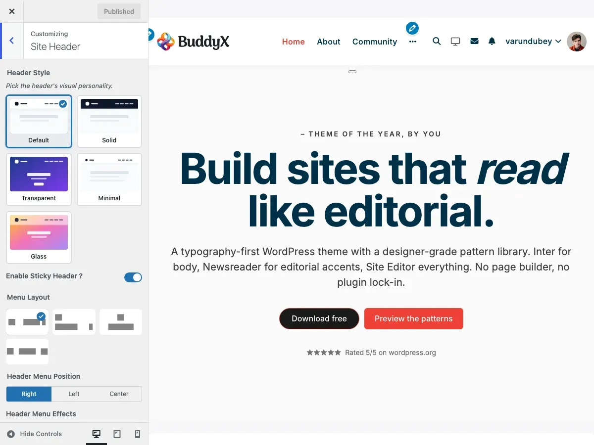
Accessing Header Settings
Section titled “Accessing Header Settings”- Go to Appearance > Customize
- Open the Site Header section
Header Style (Visual Presets)
Section titled “Header Style (Visual Presets)”Header Style (site_header_style) sets the header’s visual personality. It is a layer above the Menu Layout choice, so you can pair any menu layout with any style. There are five presets.
| Style | What It Does | Default |
|---|---|---|
| Default | The standard Pro header (solid background, soft shadow on scroll) | Yes |
| Solid | A flat colored bar with a 1px bottom border, no shadow | - |
| Transparent | Sits over a hero image or page cover with no background fill | - |
| Minimal | Thin, compact bar with a 1px divider | - |
| Glass | Frosted-glass effect: backdrop blur with a semi-transparent fill | - |
How to change:
- Go to Appearance > Customize and open the Site Header section
- Pick a swatch under Header Style
- Click Publish
Default keeps existing sites rendering exactly as before, so switching styles is always safe to preview and revert.
Menu Layout (Logo & Navigation Arrangement)
Section titled “Menu Layout (Logo & Navigation Arrangement)”Menu Layout (site_header_layout) chooses one of four arrangements for the logo and navigation. In the Customizer this control is labelled Menu Layout and shown as four image swatches.
| Swatch | Value | Arrangement |
|---|---|---|
| Layout 1 | default |
Logo left, menu right (or repositioned via Header Menu Position) |
| Layout 2 | style_2 |
Logo left, menu on a full-width row below |
| Layout 3 | style_3 |
Logo centered, menu centered below |
| Layout 4 | style_4 |
Logo left, menu centered in the header |
Layout 1: Logo Left, Menu Right
Section titled “Layout 1: Logo Left, Menu Right”The classic header layout with logo on the left and navigation aligned to the right.
Structure:
[Logo] .......................... [Primary Menu] [Icons]Best For:
- Traditional business websites
- Corporate sites
- Most common layout expectation
- Sites with extensive navigation menus
Features:
- Logo positioned at far left
- Primary navigation aligned right
- Header icons (search, cart, notifications) after menu
- Clean, professional appearance
Layout 2: Logo Left, Menu Below
Section titled “Layout 2: Logo Left, Menu Below”A two-row header with the logo on top left and navigation row below it.
Structure:
[Logo] ...................... [Header Icons/Search]---------------------------------------------------[Primary Menu - Full Width]Best For:
- Large navigation menus (10+ items)
- Sites with prominent search functionality
- E-commerce sites with cart prominence
- Community sites with many navigation options
Features:
- Larger logo display area
- Full-width navigation bar below logo
- More space for header elements
- Clear visual hierarchy
Layout 3: Logo Center, Menu Below
Section titled “Layout 3: Logo Center, Menu Below”A stacked layout with centered logo above centered navigation.
Structure:
[Logo]--------------------------------------------------- [Primary Menu - Centered]Best For:
- Magazine-style sites
- Portfolio websites
- Blogs with strong branding
- Sites wanting maximum logo visibility
Features:
- Maximum logo prominence
- Centered visual balance
- Elegant, editorial feel
- Works well with horizontal logos
Layout 4: Logo Left, Menu Centered
Section titled “Layout 4: Logo Left, Menu Centered”A single-row layout with logo on the left and navigation menu centered in the header.
Structure:
[Logo] ....... [Primary Menu - Centered] ....... [Icons]Best For:
- Brand-focused websites
- Creative portfolios
- Sites wanting balanced visual appearance
- Modern, clean designs
Features:
- Logo positioned at left
- Menu items centered in available space
- Header icons on right
- Balanced, symmetrical look
Header Elements Configuration
Section titled “Header Elements Configuration”Each layout supports configurable header elements:
Logo Settings
Section titled “Logo Settings”Logo image, size, and dark-mode logo are set in the WordPress Site Identity section, not in Site Header.
| Setting | Setting ID | Description | Location |
|---|---|---|---|
| Logo | custom_logo |
Primary logo upload | Site Identity |
| Logo Size | logo_size |
Desktop logo width (150-300px, default 150px) | Site Identity |
| Dark Mode Logo | dark_mode_logo |
Alternate logo for dark mode | Site Identity |
Navigation Settings
Section titled “Navigation Settings”| Setting | Setting ID | Description | Default |
|---|---|---|---|
| Primary Menu | (Menus) | Main navigation menu, assigned to the “Primary - Logged in users” location | Assigned in Menus |
| Header Menu Effects | site_header_menu_effect |
Hover effect for menu items | No Effect |
Header Menu Position
Section titled “Header Menu Position”When you use Layout 1 (Logo Left, Menu Right), the Header Menu Position control (site_header_menu_position) decides where the primary menu sits within the header bar.
| Option | Result | Default |
|---|---|---|
| Right | Menu aligned to the right of the header | Yes |
| Left | Menu aligned next to the logo on the left | - |
| Center | Menu centered in the available space | - |
This control only appears when Menu Layout is set to Layout 1 (default). The other layouts fix the menu position as part of their design.
Header Menu Effects
Section titled “Header Menu Effects”Add a hover effect to your navigation menu items via Header Menu Effects (site_header_menu_effect). Choose from four options:
| Effect | Description | Best For |
|---|---|---|
| No Effect | Standard hover (color change only) | Minimal, clean designs |
| Effect 1 | Dot indicator above menu item | Modern, subtle indication |
| Effect 2 | Underline animation | Professional, corporate sites |
| Effect 3 | Brackets around menu item | Creative, unique styling |
How to Change:
- Go to Appearance > Customize and open the Site Header section
- Find the Header Menu Effects dropdown
- Select your preferred effect
- Preview by hovering over menu items
- Click Publish
Header Elements
Section titled “Header Elements”Configure which elements appear in the header area. Every toggle is a Yes / No switch and lives in the Site Header section. See Header Elements & Icons for full detail.
| Setting | Setting ID | Options | Default |
|---|---|---|---|
| More Menu ? | site_more_menu |
Yes / No | Yes |
| Site Search ? | site_search |
Yes / No | Yes |
| Site Search Style | side_search_style |
Default, Fullwidth | Default |
| Site Cart ? | site_cart |
Yes / No (requires WooCommerce) | Yes |
| Friends Component ? | site_friend |
Yes / No (requires BuddyPress) | No |
| Messages Component ? | site_message |
Yes / No (requires BuddyPress) | Yes |
| Notifications Component ? | site_notification |
Yes / No (requires BuddyPress) | Yes |
| Site Login Link ? | site_login_link |
Yes / No | Yes |
| Site Register Link ? | site_register_link |
Yes / No | Yes |
| Login/Register Button Style | site_header_button_style |
Icon+Text, Only Icon, Only Text, Icon+Text Button, Icon Button, Text Button | Icon+Text |
Sticky Header
Section titled “Sticky Header”Enable a fixed header that stays visible while scrolling. BuddyX Pro ships a single on/off control for this.
| Setting | Setting ID | Description | Default |
|---|---|---|---|
| Enable Sticky Header ? | site_sticky_header |
Fix the header to the top of the screen on scroll | Yes |
When enabled, the theme adds a sticky-header body class and the header stays pinned as the page scrolls. See Sticky Header for details.
Mobile Header
Section titled “Mobile Header”The header switches from the full desktop menu to a hamburger menu based on the Hamburger Menu Breakpoint control.
| Setting | Setting ID | Range | Default |
|---|---|---|---|
| Hamburger Menu Breakpoint | site_hamburger_menu_breakpoint |
768px to 1600px | 768px |
Below the breakpoint width, the navigation collapses into the hamburger menu. See Mobile Header for details.
Layout Comparison
Section titled “Layout Comparison”| Feature | Layout 1 | Layout 2 | Layout 3 | Layout 4 |
|---|---|---|---|---|
| Logo Position | Left | Left | Center | Left |
| Menu Position | Right | Below | Below Center | Centered |
| Rows | 1 | 2 | 2 | 1 |
| Logo Prominence | Medium | Medium | High | Medium |
| Menu Capacity | Medium | High | Medium | Medium |
| Best For | Business | Large Menus | Editorial | Modern/Balanced |
Configuration Examples
Section titled “Configuration Examples”Example 1: Corporate Website
Section titled “Example 1: Corporate Website”Layout: Layout 1 (Logo Left, Menu Right)Sticky Header: EnabledHeader Icons: Search onlyMobile: Hamburger menuExample 2: Community Platform
Section titled “Example 2: Community Platform”Layout: Layout 2 (Logo Left, Menu Below)Sticky Header: EnabledHeader Elements: Search, Notifications, Messages, CartMobile: Side panel navigationExample 3: Portfolio Site
Section titled “Example 3: Portfolio Site”Layout: Layout 3 (Logo Center, Menu Below)Sticky Header: DisabledHeader Icons: NoneMenu Items: Work, About, ContactMobile: Minimal hamburgerTroubleshooting
Section titled “Troubleshooting”Menu Items Not Aligning Correctly
Section titled “Menu Items Not Aligning Correctly”Problem: Navigation doesn’t align as expected in chosen layout.
Solutions:
- Check menu is assigned to Primary Menu location
- Verify no CSS conflicts from plugins
- Clear caching plugins
- Try a different layout temporarily to compare
Sticky Header Jumping
Section titled “Sticky Header Jumping”Problem: Content jumps when sticky header activates.
Solutions:
- This is normal - space is reserved for the header
- Check for conflicting sticky-header plugins
- Adjust body padding in custom CSS if needed
Header Elements Overlapping
Section titled “Header Elements Overlapping”Problem: Icons or menu items overlap on certain screen sizes.
Solutions:
- Reduce number of visible header icons
- Shorten menu item text
- Use mobile breakpoints appropriately
- Consider Layout 3 for more horizontal space
Related Documentation
Section titled “Related Documentation”- Header Elements & Icons - Configure header icons
- Sticky Header - Fixed header settings
- Mobile Header - Mobile-specific options
- Topbar Configuration - Above-header bar
Got a question? We’re a friendly team - happy to help.
- Visit our Documentation Portal
- Email us at support@wbcomdesigns.com