

Site Layout Options
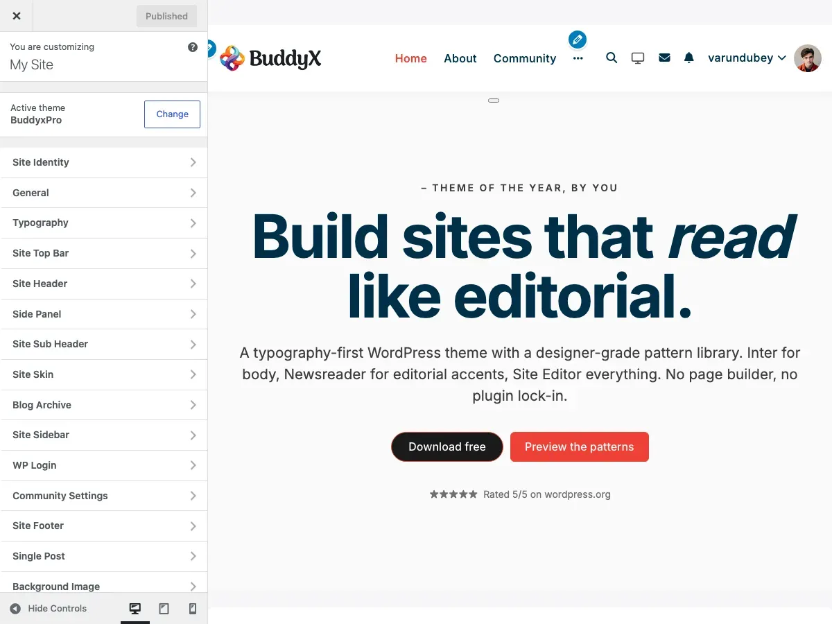
The site layout controls how your website content is displayed across the screen. BuddyX Pro offers flexible layout options to match your design preferences and content strategy.
What You Can Do
Section titled “What You Can Do”With BuddyX Pro’s layout settings, you can:
- Choose between full-width or boxed layouts
- Set custom container widths for your content
- Control sidebar dimensions
- Adjust border radius for design consistency
- Optimize layouts for different screen sizes
- Create unique layouts for blogs, shops, and community pages
Site Layout Types
Section titled “Site Layout Types”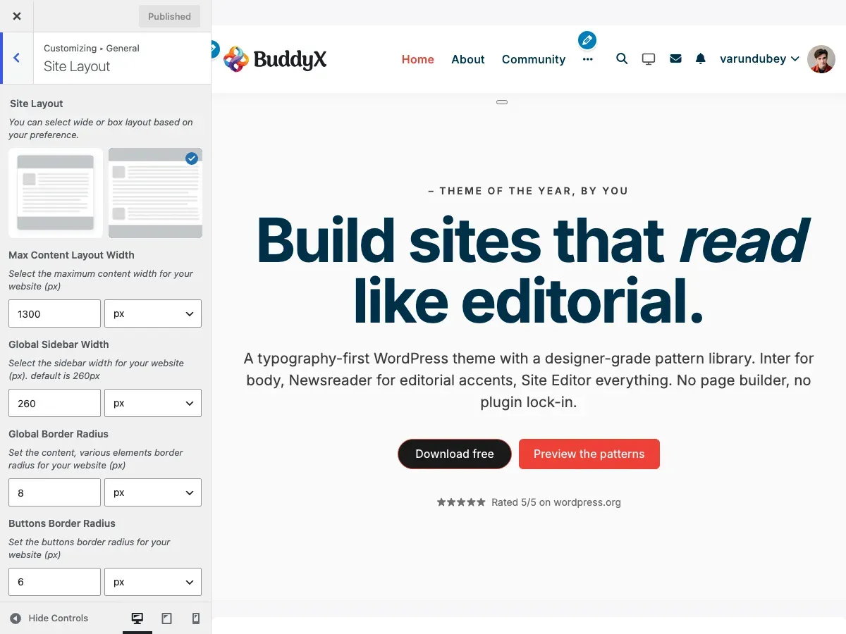
Wide Layout (Default)
Section titled “Wide Layout (Default)”Content stretches to fill the browser window width:
┌───────────────────────────────────────────────────┐│ Header (full width) │├───────────────────────────────────────────────────┤│ ││ Content stretches to window edges ││ │└───────────────────────────────────────────────────┘Best for:
- Modern, spacious designs
- Image-heavy websites
- Community platforms with activity feeds
- E-commerce stores with product galleries
Boxed Layout
Section titled “Boxed Layout”
Content is contained within a fixed-width box with visible margins:
┌─────────────────────────────────────────────────┐│ ││ ┌─────────────────────────────────────────┐ ││ │ Header (boxed) │ ││ ├─────────────────────────────────────────┤ ││ │ │ ││ │ Content within fixed container │ ││ │ │ ││ └─────────────────────────────────────────┘ ││ │└─────────────────────────────────────────────────┘Best for:
- Traditional, focused designs
- Text-heavy blogs
- Corporate websites
- Portfolio sites
Choosing Your Layout
Section titled “Choosing Your Layout”- Go to Appearance > Customize
- Click on General > Site Layout
- Select your preferred layout:
- Click Wide for full-width layout
- Click Boxed for contained layout
- Click Publish
Container Width Settings
Section titled “Container Width Settings”Max Content Layout Width
Section titled “Max Content Layout Width”This controls the maximum width of your content area.
Location: Appearance > Customize > General > Site Layout
| Setting | Default | Typical Range |
|---|---|---|
| Max Width | 1300px | 1140px - 1920px |
How to Set:
- Find Max Content Layout Width
- Enter your desired width (in pixels)
- Preview changes in real-time
- Click Publish
Common Width Values:
| Width | Use Case |
|---|---|
| 1140px | Traditional blogs, narrow content focus |
| 1200px | Balanced for most websites |
| 1300px | BuddyX Pro default, great for communities |
| 1400px | Wide layouts for e-commerce |
| 1600px+ | Portfolio sites, image galleries |
Visual Comparison
Section titled “Visual Comparison”1140px (Narrow):
┌─────────────────────────────────────────────┐│ ┌───────────────────────────────┐ ││ │ Content Area │ ││ │ (comfortable reading) │ ││ └───────────────────────────────┘ │└─────────────────────────────────────────────┘1300px (Default):
┌─────────────────────────────────────────────┐│ ┌─────────────────────────────────────┐ ││ │ Content Area │ ││ │ (balanced layout) │ ││ └─────────────────────────────────────┘ │└─────────────────────────────────────────────┘1600px (Wide):
┌─────────────────────────────────────────────┐│┌───────────────────────────────────────────┐│││ Content Area ││││ (spacious, modern) │││└───────────────────────────────────────────┘│└─────────────────────────────────────────────┘Sidebar Width
Section titled “Sidebar Width”Control the width of your sidebar areas.
Location: Appearance > Customize > General > Site Layout
| Setting | Default | Range |
|---|---|---|
| Global Sidebar Width | 260px | 200px - 400px |
Popular Configurations:
| Width | Layout Effect |
|---|---|
| 220px | Compact sidebar, more content space |
| 260px | Balanced sidebar (default) |
| 300px | Wide sidebar, featured widgets |
| 350px | Very prominent sidebar |
Example with Sidebar:
┌──────────────────────────────────────────┐│ Main Content │ Sidebar ││ (wider area) │ (260px) ││ │ ││ Blog posts, │ - Widget 1 ││ product listings, │ - Widget 2 ││ or page content │ - Widget 3 │└──────────────────────────────────────────┘Border Radius Settings
Section titled “Border Radius Settings”Create consistent rounded corners throughout your site.
Location: Appearance > Customize > General > Site Layout
Global Border Radius
Section titled “Global Border Radius”Controls roundness of content boxes, cards, and containers.
| Setting | Default | Effect |
|---|---|---|
| Global Border Radius | 8px | Subtle rounded corners |
Visual Guide:
| Value | Appearance | Best For |
|---|---|---|
| 0px | Sharp corners | Modern, geometric designs |
| 4px | Slightly rounded | Minimalist, clean look |
| 8px | Noticeable rounds (default) | Friendly, approachable |
| 12px | Very rounded | Playful, modern designs |
| 20px+ | Heavily rounded | Bold, distinctive style |
Button Border Radius
Section titled “Button Border Radius”Separate control for all button styles.
| Setting | Default |
|---|---|
| Buttons Border Radius | 6px |
Examples:
0px: [ Click Me ] ← Sharp edges6px: ( Click Me ) ← Default, balanced12px: ( Click Me ) ← Very rounded30px: ( Click Me ) ← Pill-shapedForm Border Radius
Section titled “Form Border Radius”Controls input fields, dropdowns, and textboxes.
| Setting | Default |
|---|---|
| Form Border Radius | 6px |
Note: Textareas are excluded to maintain distinction between single-line and multi-line inputs.
Recommended Setups by Site Type
Section titled “Recommended Setups by Site Type”Blog / Magazine
Section titled “Blog / Magazine”Layout: WideContainer Width: 1200pxSidebar Width: 280pxGlobal Border Radius: 8pxButtons Border Radius: 6pxForm Border Radius: 6pxWhy: Comfortable reading width with prominent sidebar for featured content and ads.
E-Commerce Store
Section titled “E-Commerce Store”Layout: WideContainer Width: 1400pxSidebar Width: 260pxGlobal Border Radius: 8pxButtons Border Radius: 4pxForm Border Radius: 4pxWhy: Wider layout showcases more products; subtle borders keep focus on products.
Community Platform
Section titled “Community Platform”Layout: WideContainer Width: 1300pxSidebar Width: 240pxGlobal Border Radius: 10pxButtons Border Radius: 6pxForm Border Radius: 6pxWhy: Default BuddyX Pro setup optimized for social interaction and activity feeds.
Corporate Website
Section titled “Corporate Website”Layout: BoxedContainer Width: 1140pxSidebar Width: 300pxGlobal Border Radius: 4pxButtons Border Radius: 3pxForm Border Radius: 3pxWhy: Traditional, professional appearance with strong content focus.
Portfolio / Creative
Section titled “Portfolio / Creative”Layout: WideContainer Width: 1600pxSidebar Width: 220px (minimal)Global Border Radius: 12pxButtons Border Radius: 20pxForm Border Radius: 8pxWhy: Maximum space for showcasing creative work; bold, modern styling.
Educational / LMS
Section titled “Educational / LMS”Layout: WideContainer Width: 1300pxSidebar Width: 280pxGlobal Border Radius: 8pxButtons Border Radius: 6pxForm Border Radius: 6pxWhy: Balanced layout for course listings and lesson content with sidebar for progress tracking.
Responsive Behavior
Section titled “Responsive Behavior”Your layout automatically adapts to different screen sizes:
| Screen Size | Behavior |
|---|---|
| Desktop (1200px+) | Full settings applied |
| Tablet (768px - 1199px) | Content width adjusts proportionally |
| Mobile (< 768px) | Single column, no sidebar |
Mobile Layout:
┌─────────────────┐│ Header │├─────────────────┤│ ││ Main Content ││ (full width) ││ │├─────────────────┤│ ││ Sidebar Below ││ │└─────────────────┘Advanced Customization
Section titled “Advanced Customization”Custom Width for Specific Pages
Section titled “Custom Width for Specific Pages”You can override the global width for individual pages using WordPress page settings or custom CSS.
Using Custom CSS:
/* Make specific page wider */.page-id-123 .container {    max-width: 1600px;}
/* Make blog archive narrower */.blog .container {    max-width: 1000px;}
Different Widths by Plugin
Section titled “Different Widths by Plugin”Some plugins automatically adjust container width:
| Plugin | Behavior |
|---|---|
| WooCommerce | Shop pages follow WooCommerce settings |
| LearnDash | Course pages can have custom widths |
| BuddyPress | Profile pages use optimized widths |
Performance Tips
Section titled “Performance Tips”| Tip | Benefit |
|---|---|
| Use standard widths | Easier for browsers to render consistently |
| Avoid extreme values | Very wide layouts (2000px+) can look broken on some screens |
| Test on real devices | Check layout on actual phones and tablets |
| Consider reading comfort | Text lines shouldn’t exceed 80-90 characters for readability |
Common Questions
Section titled “Common Questions”What’s the difference between Wide and Boxed layouts? Wide layouts stretch content edge-to-edge within the container width. Boxed layouts add visible spacing around the entire site, creating a “card” effect.
Can I use different layouts on different pages? Yes! You can set individual page layouts through page meta boxes or use child theme code to customize specific pages.
Does container width affect mobile view? On mobile devices, content automatically adjusts to fit the screen width regardless of your desktop container setting.
What if my content looks too narrow or too wide? Adjust the Max Content Layout Width. Most sites work well between 1200px - 1400px. Test with your actual content.
Can I have a wide header but boxed content? Yes! The header can span full-width while content remains boxed. This is controlled in Header settings.
Why do my images look smaller after changing width? Images display relative to container width. You may need to regenerate thumbnails or adjust image sizes after major width changes.
Should I match border radius everywhere? Not necessarily! Using 8px for content boxes, 6px for buttons, and 6px for forms creates subtle visual hierarchy while maintaining consistency.
Related Settings
Section titled “Related Settings”- Site Loader - Loading animation settings
- Sidebar Layouts - Sidebar positioning options
- Header Layouts - Header width and style
- Blog Layout - Blog-specific layouts
- Border Radius & Styling - Advanced border styling
Got a question? We’re a friendly team - happy to help.
- Visit our Documentation Portal
- Email us at support@wbcomdesigns.com