

Appearance and Branding
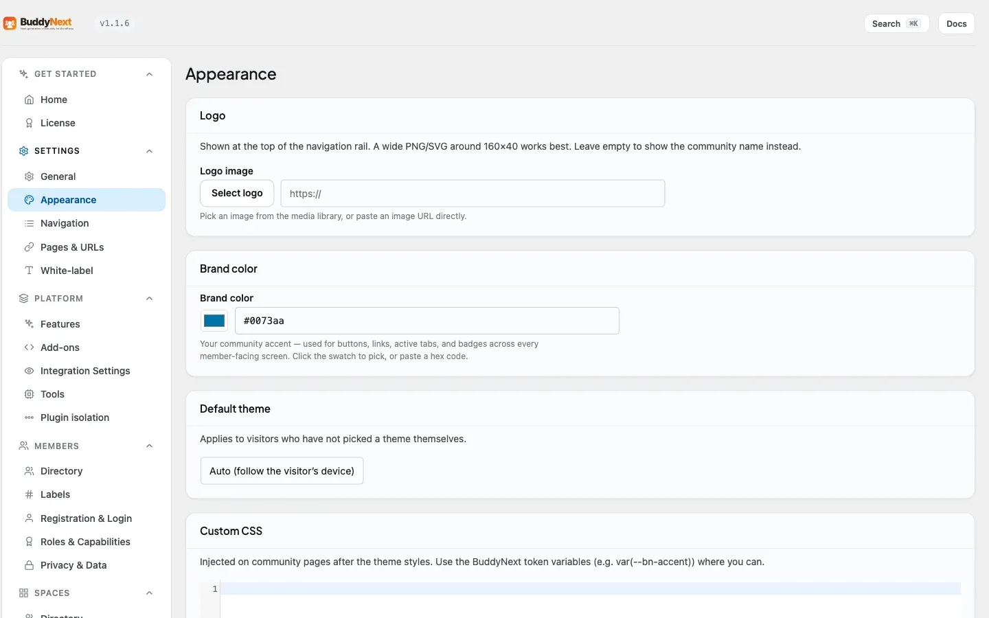
Appearance and Branding is where you make the community look like yours - your logo at the top of the navigation, your brand color running through buttons and links, and a default light or dark theme for visitors who have not chosen one. Most of it is a couple of fields and a color swatch, so a new community can carry your identity in minutes. The controls sit across BuddyNext > Settings > General (community name) and BuddyNext > Settings > Appearance (logo, brand color, default theme, custom CSS).
Why use it
Section titled “Why use it”Members trust a community that looks like the brand that invited them. A generic install with no logo and a default blue accent feels like a demo; the same community with your mark in the corner and your color on every button feels like home. Branding is also practical - a recognizable accent color makes buttons, active tabs, and links obvious, which quietly improves how easy the community is to use.
Community name
Section titled “Community name”Set under Settings > General, the Community Name is how your community refers to itself in headings and copy. If you do not upload a logo, this name is shown at the top of the navigation instead, so it is worth getting right even on a logo-free site.
Brand color
Section titled “Brand color”Under Settings > Appearance, Brand color is your community’s accent. It is used for buttons, links, active tabs, and badges across every member-facing screen. Click the swatch to pick a color, or paste a hex code if you have an exact brand value. One color change re-themes the whole community consistently - you do not style each element by hand.
Under Settings > Appearance, the Logo is shown at the top of the navigation rail. A wide PNG or SVG around 160 by 40 pixels works best. You can select an image from the WordPress media library or paste an image URL. Leave it empty and BuddyNext shows your community name in its place, so there is always something branded in the corner.
Default theme (auto, light, or dark)
Section titled “Default theme (auto, light, or dark)”The Default theme setting chooses what new visitors see to start with. It offers three choices - Auto (follow the visitor’s own device setting), Light, and Dark - and defaults to Auto, so someone whose phone or laptop is in dark mode sees a dark community without doing anything. It applies only to people who have not picked a theme for themselves - once a member chooses, their choice sticks.
BuddyNext does not add its own light/dark switch. Instead it follows the toggle your WordPress theme already provides. If your site runs a theme with a color-mode toggle, such as BuddyX or Reign, flipping that toggle switches BuddyNext along with it, with no extra setup. Dark mode reaches the whole community - including form controls, profile skill chips, and badges - so a dark layout stays dark end to end.
Custom CSS
Section titled “Custom CSS”For finer visual tweaks, the Custom CSS box under Settings > Appearance lets you add your own styles. It is injected on community pages after the theme’s own styles. Where you can, use BuddyNext’s built-in design variables (for example the accent color variable) so your tweaks track your brand color and dark mode automatically instead of fighting them.
Note: Because the whole community reads from one brand color and one set of design tokens, small branding changes ripple everywhere at once. Set your color and logo first, then only reach for Custom CSS if you need something the standard controls do not cover.
Related
Section titled “Related”- Admin Setup Wizard - sets your name and brand color on first run.
- Choosing a Theme - the host theme whose light/dark toggle BuddyNext follows.
- Admin Overview - where the Appearance and General settings live.
- Design System Tokens - the variables to use in Custom CSS.