

Navigation Menus
BuddyX Pro provides multiple menu locations for comprehensive site navigation.
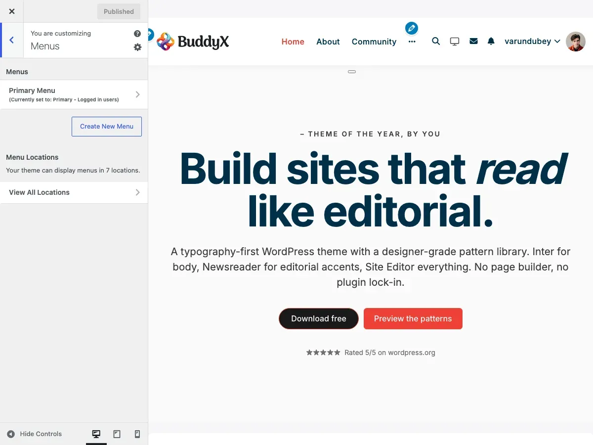
Menu Locations
Section titled “Menu Locations”BuddyX Pro registers 7 menu locations:
Primary Menus
Section titled “Primary Menus”| Location | Description |
|---|---|
| Primary - Logged in users | Main header navigation for logged-in members |
| Primary - Logged out users | Main header navigation for visitors |
Mobile Menus
Section titled “Mobile Menus”| Location | Description |
|---|---|
| Mobile Menu - Logged in users | Mobile navigation for logged-in members |
| Mobile Menu - Logged out users | Mobile navigation for visitors |
Side Panel Menus
Section titled “Side Panel Menus”| Location | Description |
|---|---|
| Side Menu - Logged in users | Side panel menu for logged-in members |
| Side Menu - Logged out users | Side panel menu for visitors |
User Menu
Section titled “User Menu”| Location | Description |
|---|---|
| User Menu | User account dropdown menu in header |
Creating Menus
Section titled “Creating Menus”Step 1: Create a Menu
Section titled “Step 1: Create a Menu”- Go to Appearance → Menus
- Click Create a new menu
- Enter a menu name (e.g., “Main Menu”)
- Click Create Menu
Step 2: Add Menu Items
Section titled “Step 2: Add Menu Items”Add items from:
- Pages - Site pages
- Posts - Blog posts
- Custom Links - External URLs
- Categories - Post categories
- BuddyPress - Community pages (if active)
- WooCommerce - Shop pages (if active)
Step 3: Assign Location
Section titled “Step 3: Assign Location”- Scroll to Menu Settings
- Check the desired location(s)
- Click Save Menu
Menu Configuration
Section titled “Menu Configuration”Logged In vs Logged Out Menus
Section titled “Logged In vs Logged Out Menus”BuddyX Pro shows different menus based on login status:
Logged In Users See:
- Member dashboard links
- Profile and settings
- Logout option
- Community features
Logged Out Users See:
- Login/Register links
- Public pages only
- Promotional content
Setting Up Both Menus
Section titled “Setting Up Both Menus”-
Create a “Main Menu (Logged In)” menu
- Assign to: Primary - Logged in users
-
Create a “Main Menu (Logged Out)” menu
- Assign to: Primary - Logged out users
Mobile Menu
Section titled “Mobile Menu”The mobile menu appears on screens below the responsive breakpoint.
Mobile Menu Setup
Section titled “Mobile Menu Setup”- Create a menu specifically for mobile
- Keep it simpler than desktop menu
- Assign to: Mobile Menu - Logged in/out users
Tips for Mobile Menus:
- Limit to 6-8 top-level items
- Use shorter link text
- Prioritize important links
- Test on actual devices
Side Panel Menu
Section titled “Side Panel Menu”The side panel (hamburger menu) provides additional navigation.
Enabling Side Panel
Section titled “Enabling Side Panel”- Go to Appearance → Customize → Side Panel
- Enable the side panel
- Configure display options
Side Panel Menu Setup
Section titled “Side Panel Menu Setup”- Create a menu for the side panel
- Assign to: Side Menu - Logged in/out users
- Consider vertical layout when designing
User Menu
Section titled “User Menu”The user menu appears when clicking the user avatar in the header.
User Menu Contents
Section titled “User Menu Contents”Typically includes:
- Profile link
- Account settings
- Dashboard
- Orders (if WooCommerce)
- Courses (if LearnDash)
- Logout
Setting Up User Menu
Section titled “Setting Up User Menu”- Create a “User Menu” menu
- Add user-specific links
- Assign to: User Menu location
Menu Icons
Section titled “Menu Icons”Add icons to menu items using CSS classes.
Using FontAwesome Icons
Section titled “Using FontAwesome Icons”- Edit a menu item
- In CSS Classes field, add:
menu-icon fas fa-home - Save the menu
Common icons:
fas fa-home- Homefas fa-user- Profilefas fa-cog- Settingsfas fa-shopping-cart- Cartfas fa-sign-out-alt- Logout
Enabling CSS Classes Field
Section titled “Enabling CSS Classes Field”- Click Screen Options at top of Menus page
- Check CSS Classes
- The field now appears for each menu item
Dropdown Menus
Section titled “Dropdown Menus”Create multi-level navigation with dropdowns.
Creating Dropdowns
Section titled “Creating Dropdowns”- Add menu items normally
- Drag child items slightly to the right
- They indent under the parent item
- Save the menu
Dropdown Behavior
Section titled “Dropdown Behavior”- Desktop: Hover to reveal dropdown
- Mobile: Tap to expand/collapse
- Auto-close when clicking elsewhere
BuddyPress Menu Items
Section titled “BuddyPress Menu Items”When BuddyPress is active, additional menu items are available:
| Item | Description |
|---|---|
| Activity | Activity feed |
| Members | Members directory |
| Groups | Groups directory |
| Profile | Current user’s profile |
| Settings | Account settings |
Adding BuddyPress Items
Section titled “Adding BuddyPress Items”- In the menu editor, find BuddyPress section
- Check desired items
- Click Add to Menu
WooCommerce Menu Items
Section titled “WooCommerce Menu Items”When WooCommerce is active:
| Item | Description |
|---|---|
| Shop | Product archive |
| Cart | Shopping cart |
| Checkout | Checkout page |
| My Account | Account dashboard |
Menu Settings
Section titled “Menu Settings”Display Options
Section titled “Display Options”In Menu Settings at bottom of menu editor:
- Auto add pages - Automatically add new top-level pages
- Menu locations - Where the menu appears
Screen Options
Section titled “Screen Options”Click Screen Options to show/hide:
- CSS Classes
- Link Target
- Title Attribute
- Link Relationship (XFN)
- Description
Best Practices
Section titled “Best Practices”Navigation Structure
Section titled “Navigation Structure”- Limit top-level items to 6-8
- Use clear, descriptive labels
- Group related items in dropdowns
- Place important items first
Accessibility
Section titled “Accessibility”- Use descriptive link text
- Avoid “Click Here” or “Read More”
- Maintain logical order
- Test keyboard navigation
Mobile Considerations
Section titled “Mobile Considerations”- Test on actual devices
- Consider thumb-friendly placement
- Keep text concise
- Limit nesting depth
Troubleshooting
Section titled “Troubleshooting”Menu Not Appearing
Section titled “Menu Not Appearing”- Verify menu is assigned to location
- Check if location is displayed in header
- Clear any caching
- Check theme customizer settings
Dropdowns Not Working
Section titled “Dropdowns Not Working”- Check for JavaScript errors
- Verify parent item has children
- Test with plugins disabled
- Check CSS for conflicts
Mobile Menu Issues
Section titled “Mobile Menu Issues”- Resize browser to trigger mobile view
- Check mobile menu is assigned
- Verify hamburger icon is enabled
- Test touch interactions
Related Documentation
Section titled “Related Documentation”- Header Options - Header configuration
- Side Panel - Side panel settings
- BuddyPress Options - BP menu integration