

Layout Modes
Requires MediaVerse Pro - This feature is available exclusively in the Pro version.
Transform your media community’s look with one click - choose the visual style that fits your audience, from Instagram-style grids to Pinterest masonry boards.
What You Can Do
Section titled “What You Can Do”- Switch between four distinct visual layouts without touching code
- Match your community’s purpose: photo sharing, discovery, portfolios, or design showcases
- Drop a specific layout on any page with its dedicated block or shortcode (Instagram, Flickr, Pinterest, Dribbble feed)
- Conditionally switch the active layout by page context using the
mvs_active_layoutfilter
The Four Layouts at a Glance
Section titled “The Four Layouts at a Glance”| Mode | Best For |
|---|---|
| Photo-sharing communities, daily uploads, stories | |
| Inspiration boards, discovery-focused sites | |
| Flickr | Photography portfolios, camera clubs |
| Dribbble | Design showcases, creative portfolios |
How to Switch Layouts (for Site Owners)
Section titled “How to Switch Layouts (for Site Owners)”- Go to Media > Settings > Display
- Find the Feed Layout option and select your preferred mode
- Click Save Settings - the explore page and all profile media tabs update immediately
The setting is stored in the mvs_pro_feed_layout option.
What Changes for Users When You Switch Layouts
Section titled “What Changes for Users When You Switch Layouts”- The explore/browse page re-renders in the new layout style
- All user profile media tabs switch to the new layout automatically
- The lightbox updates: Flickr mode shows EXIF camera data in the sidebar; Instagram shows the swipe carousel
- Stories appear above the grid in Instagram mode only
- Search and tag filtering behave identically to the default layout, including the empty states (2.2.0): a zero-result search shows “No results for …” with a Browse-all button and popular-tag chips, and an unknown tag shows “Tag not found” instead of an unfiltered feed
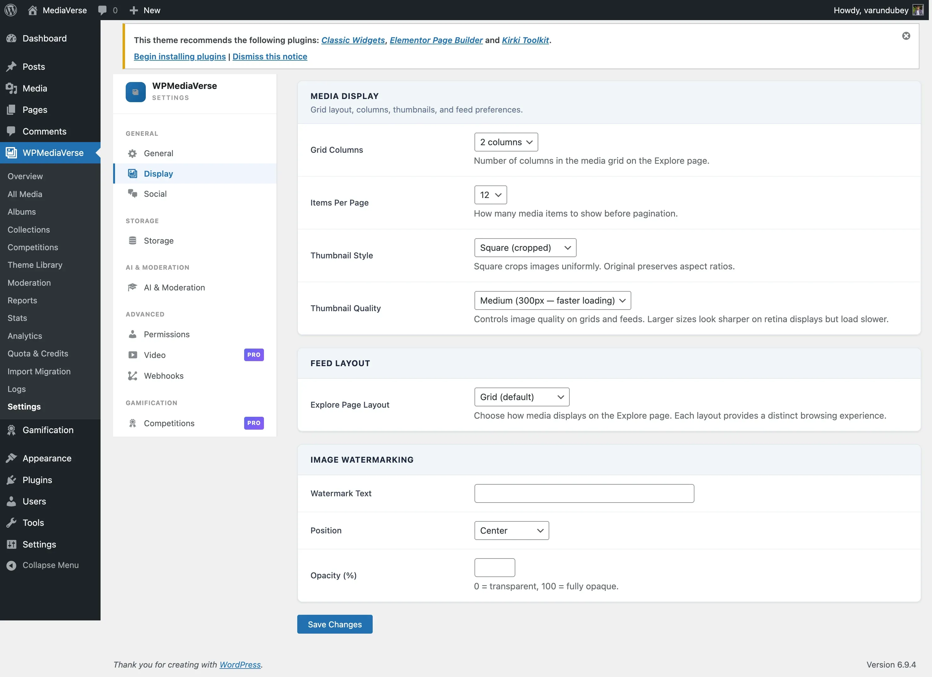
Choosing a Layout Mode
Section titled “Choosing a Layout Mode”The selected mode applies to the explore archive and the user profile media tab. For a specific layout on a specific page, use that layout’s own block (e.g. Instagram Feed) or shortcode (e.g. [mvs_pro_instagram_feed]) instead of relying on the global setting.
Instagram Mode
Section titled “Instagram Mode”Perfect for photo-sharing communities and daily uploads.
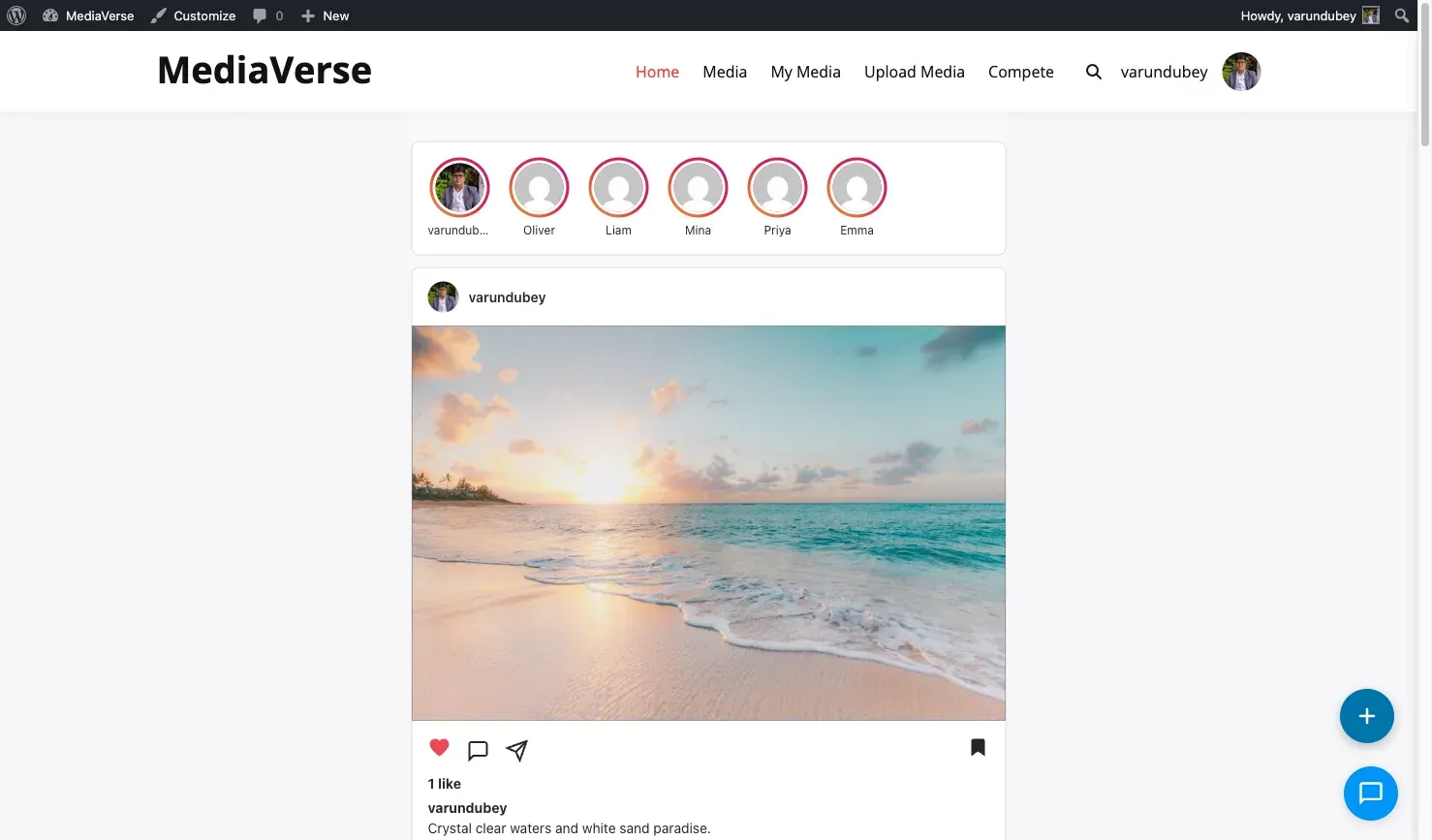
The Instagram layout renders a vertical card feed. Each post shows the author avatar, full-width photo, reaction/comment/share buttons, like count, caption, and inline comment box - identical to the Instagram experience.
- Recent uploaders appear as circular avatars above the feed (links to their profiles)
- Each card has heart, comment, share, and bookmark buttons
- Clicking “Expand” opens the lightbox with the full media detail view
- Other users’ posts show a “Following” button in the card header
Feed template: templates/layouts/instagram/feed.php
Profile template: templates/layouts/instagram/profile.php
Pinterest Mode
Section titled “Pinterest Mode”Ideal for inspiration boards, discovery-focused sites, and mixed-format content.
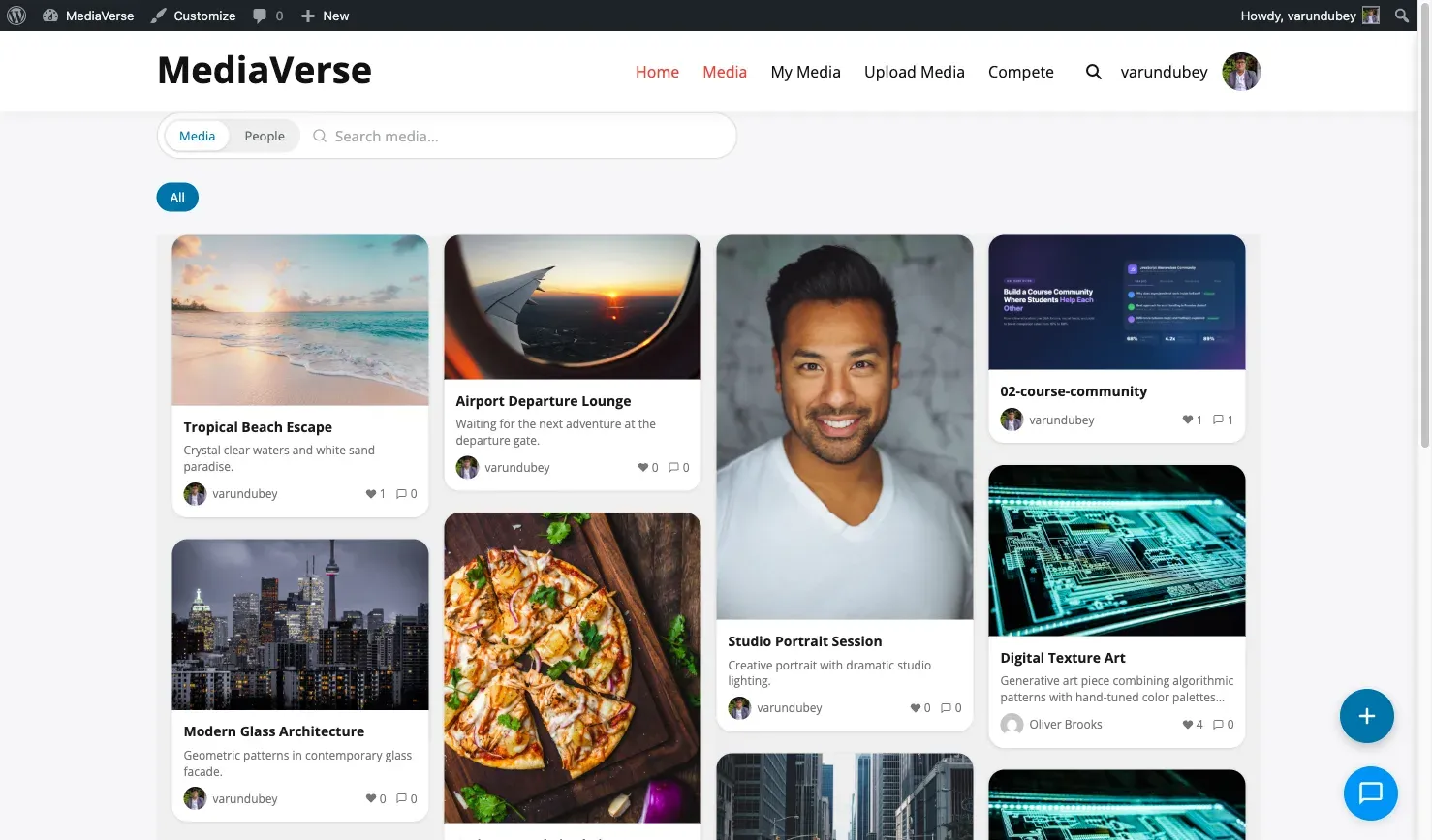
The Pinterest layout uses a masonry algorithm that preserves each image’s original proportions. Cards include the media title and a truncated description below the image.
- Column count is controlled by the Grid Columns display setting (2–4)
- Hovering a card reveals a save-to-collection button
- Infinite scroll loads the next page of results automatically
Feed template: templates/layouts/pinterest/feed.php
Profile template: templates/layouts/pinterest/profile.php
Flickr Mode
Section titled “Flickr Mode”Best for photography portfolios, camera clubs, and image-quality-focused communities.
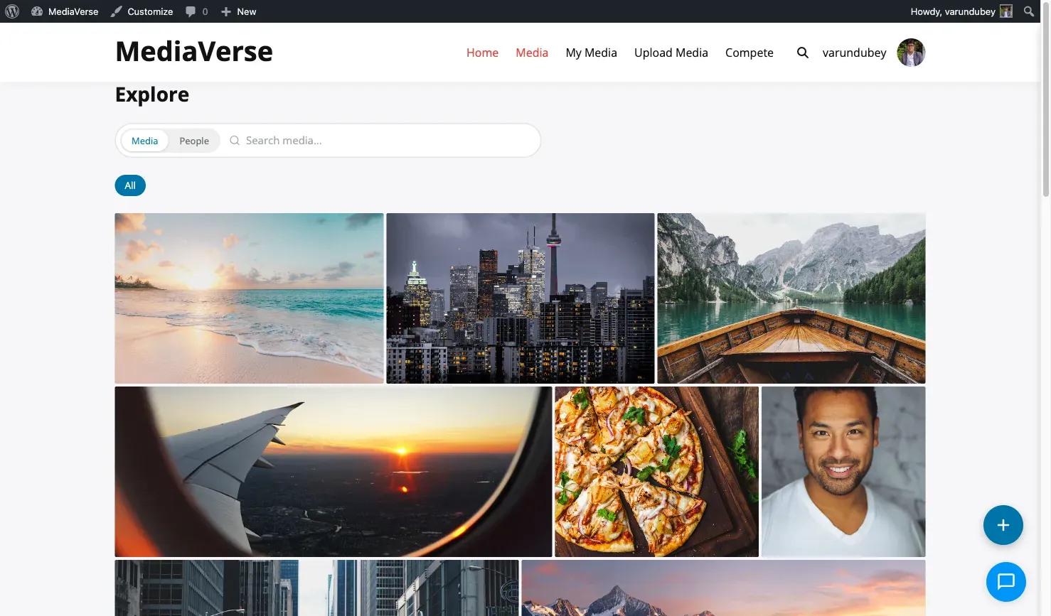
The Flickr layout uses a justified gallery algorithm: images in each row are resized to fill the full container width while maintaining a consistent row height.
- Clicking an image opens the lightbox with EXIF data displayed in the sidebar
- Profile page shows a filmstrip-style contact sheet view
Feed template: templates/layouts/flickr/feed.php
Profile template: templates/layouts/flickr/profile.php
Drop the Flickr layout on a specific page with the Flickr Feed block or the [mvs_pro_flickr_feed] shortcode.
Dribbble Mode
Section titled “Dribbble Mode”Great for design showcases, creative portfolios, and high-resolution work.
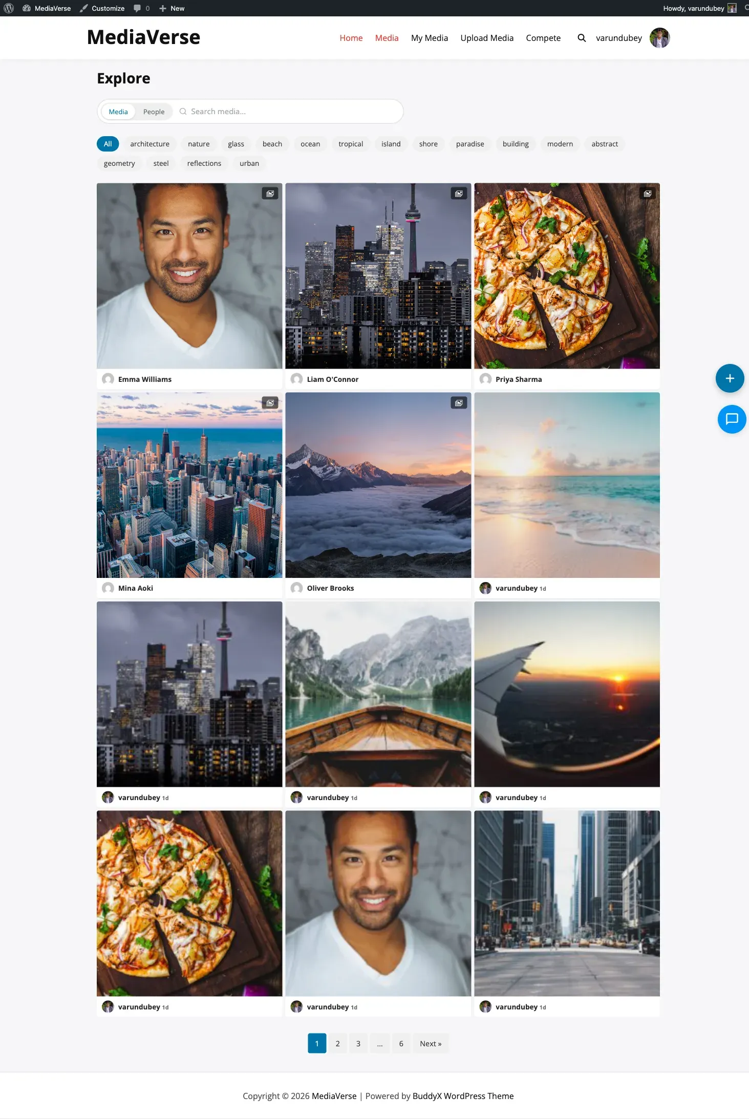
The Dribbble layout presents media as large portfolio shots in a 2-column grid. Each card shows the title, view count, and reaction count on hover. This layout is optimised for high-resolution PNG and GIF files.
- Animated GIFs play on hover
- Profile page shows featured work prominently at the top before the full grid
Feed template: templates/layouts/dribbble/feed.php
Profile template: templates/layouts/dribbble/profile.php
Putting a Specific Layout on a Specific Page
Section titled “Putting a Specific Layout on a Specific Page”Each layout ships as its own block and shortcode, so you can mix layouts across pages without changing the global setting:
| Layout | Block | Shortcode |
|---|---|---|
| Instagram Feed | [mvs_pro_instagram_feed] |
|
| Flickr | Flickr Feed | [mvs_pro_flickr_feed] |
| Pinterest Feed | [mvs_pro_pinterest_feed] |
|
| Dribbble | Dribbble Feed | [mvs_pro_dribbble_feed] |
Overriding the Active Layout in Code
Section titled “Overriding the Active Layout in Code”The global active-layout slug (read from the mvs_pro_feed_layout option) passes through the mvs_active_layout filter, so you can switch it by context:
add_filter( 'mvs_active_layout', function( $layout ) { // Force the Flickr layout on archive pages. if ( is_post_type_archive( 'mvs_media' ) ) { return 'flickr'; } return $layout;} );